



For press, partners, and designers
vAPI brand kit
The starting point for every vAPI design and motion piece. Download what you need, follow the rules beside it, and anything you make will belong to the same family.
01 Logo
The mark and the wordmark
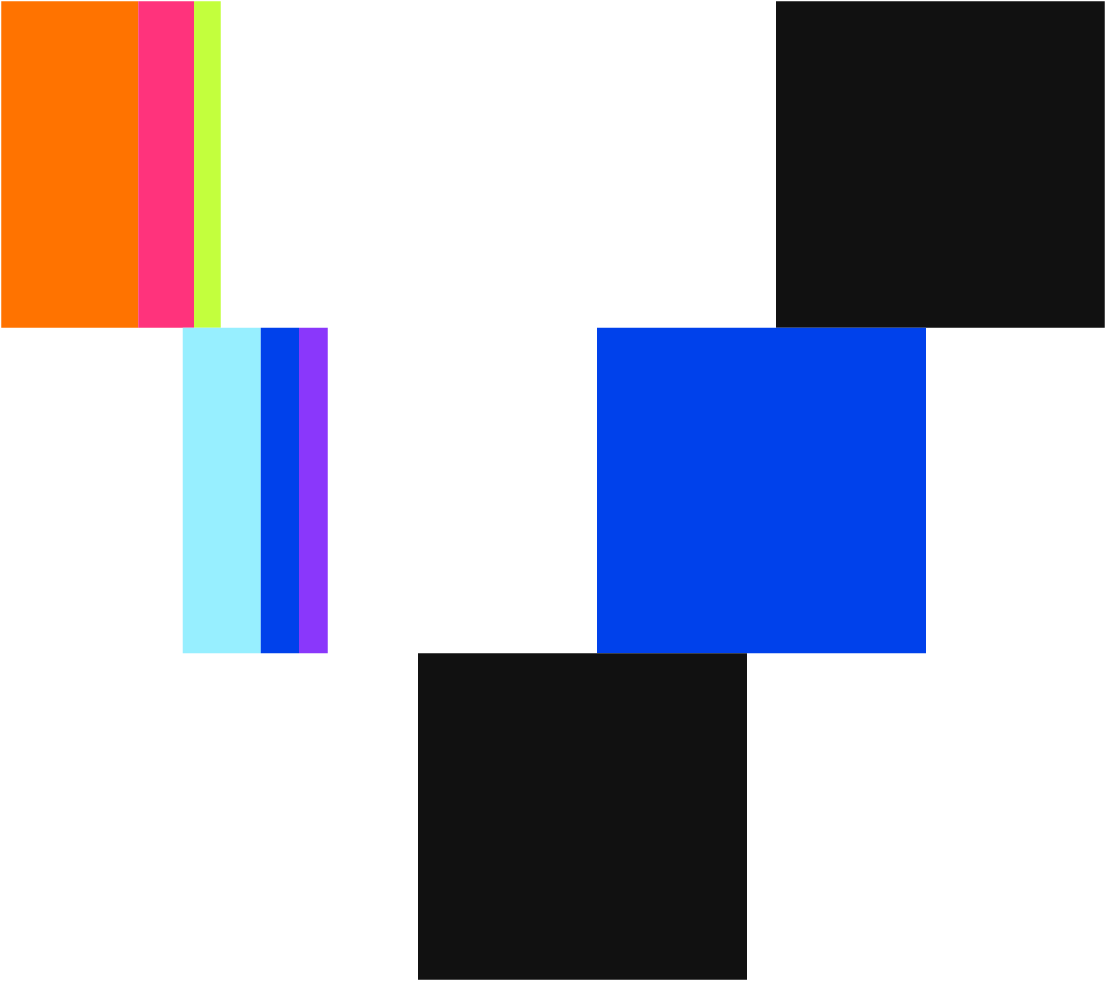
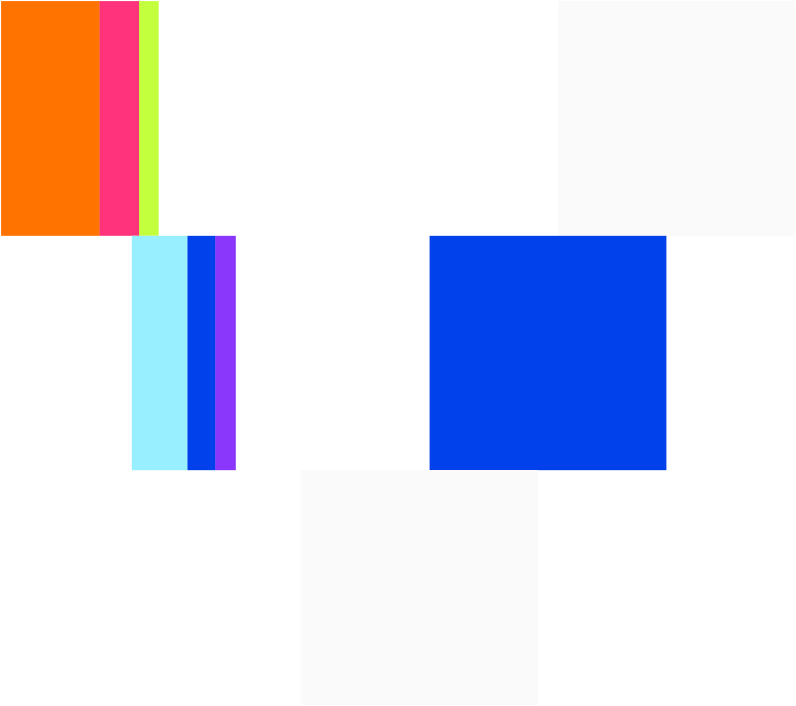
Nine solid blocks in three rows that read as the v, followed by API in Space Grotesk. The blocks carry the product's accent order and never change color, order, or spacing.

















02 Space and size
Clear space and minimum size
Keep one block height of empty space on every side of the mark or lockup. A block height is one third of the mark's height. Lockup at least 20px tall on screen and 8mm in print. Mark alone at least 16px tall.
03 Logo rules
Use it as drawn
The mark only works when it is exact. These are the uses that keep it exact, and the ones that break it.
04 Color
Paper, ink, and a rail of color
Every value here is read from the product's design tokens, so the kit and the product cannot disagree. Use token names in code and the hex values in design files.
Swatches for Adobe apps, CSS custom properties, and JSON for tooling.
ASE swatchesCSSJSONCore
Most of every layout is paper and ink. Hairlines do the separating.
Accents
Orange leads, Base blue is second, then pink, lime, cyan, and purple. Accents are details, never surfaces.
Text-safe accents
Accent hues darkened to pass 4.5:1 on white. Use these, never the raw accent, for colored text on light.
Editorial
The warm stone of the illustrations. For artwork and campaign grounds, not interface.
Proportions
Roughly how much of a layout each color owns. Accents together stay under five percent.
05 Typography
Two faces, two jobs
Space Grotesk carries everything people read. IBM Plex Mono appears only for strings a person might copy. Both ship in Regular and Medium only, under the SIL Open Font License.
ABCDEFGHIJKLMNOPQRSTUVWXYZ
abcdefghijklmnopqrstuvwxyz
0123456789 $ % & @ # → · , . : ; ( )
Medium 500: Settled through x402
ABCDEFGHIJKLMNOPQRSTUVWXYZ
abcdefghijklmnopqrstuvwxyz
0123456789 $ % & @ # → · , . : ; ( )
Medium 500: 0x7a3f…c91e
| Role | Specimen | Size | Weight | Leading | Tracking |
|---|---|---|---|---|---|
| Hero headline | Find an API. Pay the live quote. | clamp(52px, 8.5vw, 128px) | 400 | 0.98 | -0.03em |
| Section title | One rail for agents and humans | clamp(38px, 5vw, 68px) | 400 | 1.02 | -0.03em |
| Giant numeral | 2,048 | clamp(72px, 10vw, 160px) | 400 | 1.0 | -0.02em |
| Card title | Settled through x402 | 18 to 24px | 500 | 1.15 | -0.01em |
| Body | Every call is quoted live and settled onchain in USDC, with no account to open first. | 15 to 17px | 400 | 1.6 | 0 |
| Label | Settlement network | 12 to 14px | 500 | 1.3 | 0 |
| Technical string | 0x7a3f…c91e eip155:8453 | 12 to 14px | 400 | 1.5 | 0 |
Do
- DoSet headlines in Space Grotesk Regular with tight tracking. Emphasize at most one phrase in Medium.
- DoWrite in sentence case. Uppercase is only for literal acronyms like USDC and MCP.
- DoWrite the brand as vAPI, always with a lowercase v.
- DoKeep display type at 28px or larger.
Don't
- Don'tUse weights other than 400 and 500. Light, semibold, and bold are not part of the system.
- Don'tUse italics. None are shipped.
- Don'tUse IBM Plex Mono to make ordinary copy look technical.
- Don'tLower text opacity to make it quieter. Pick the dim text color instead.
06 Pairings
Type in combination
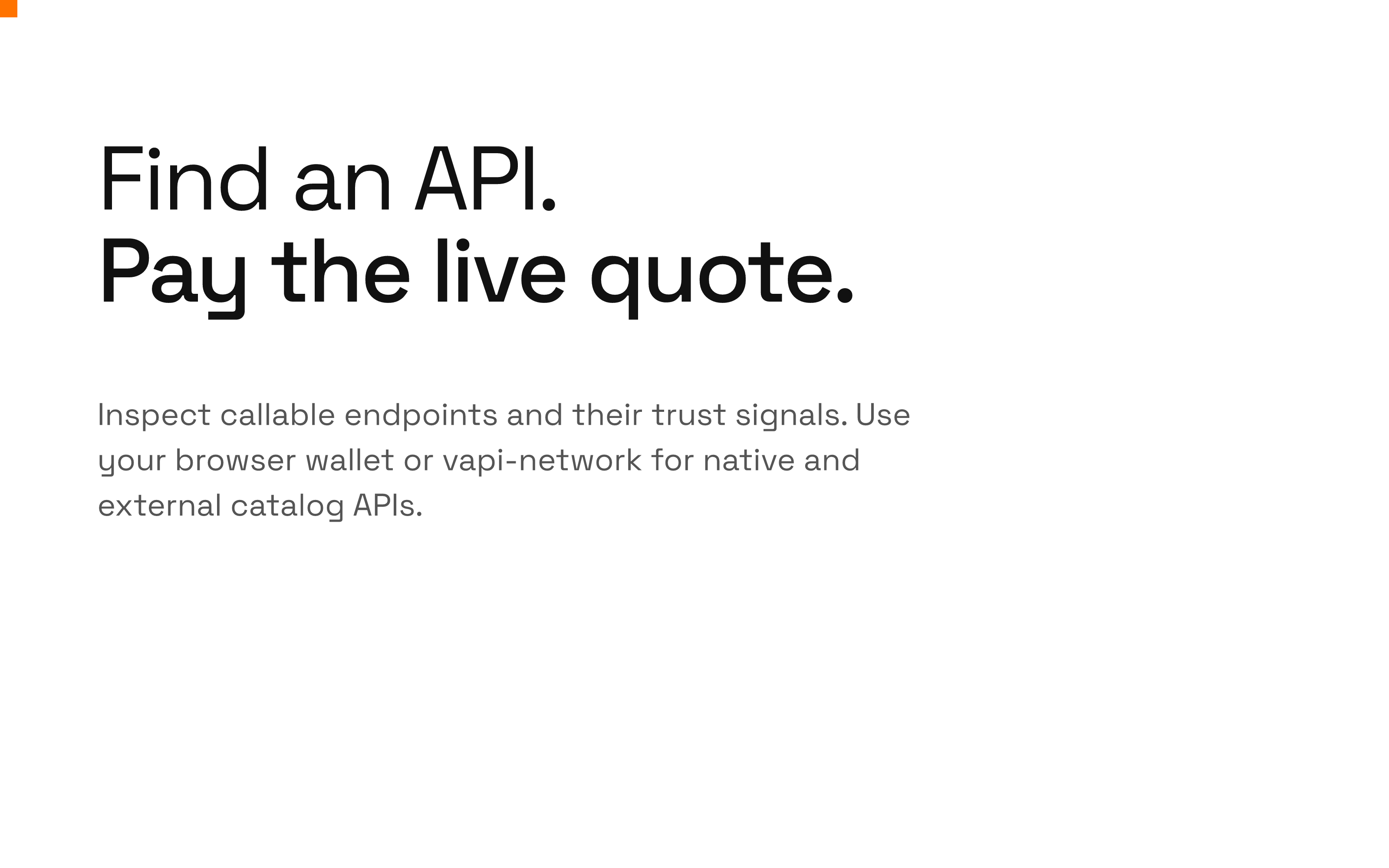
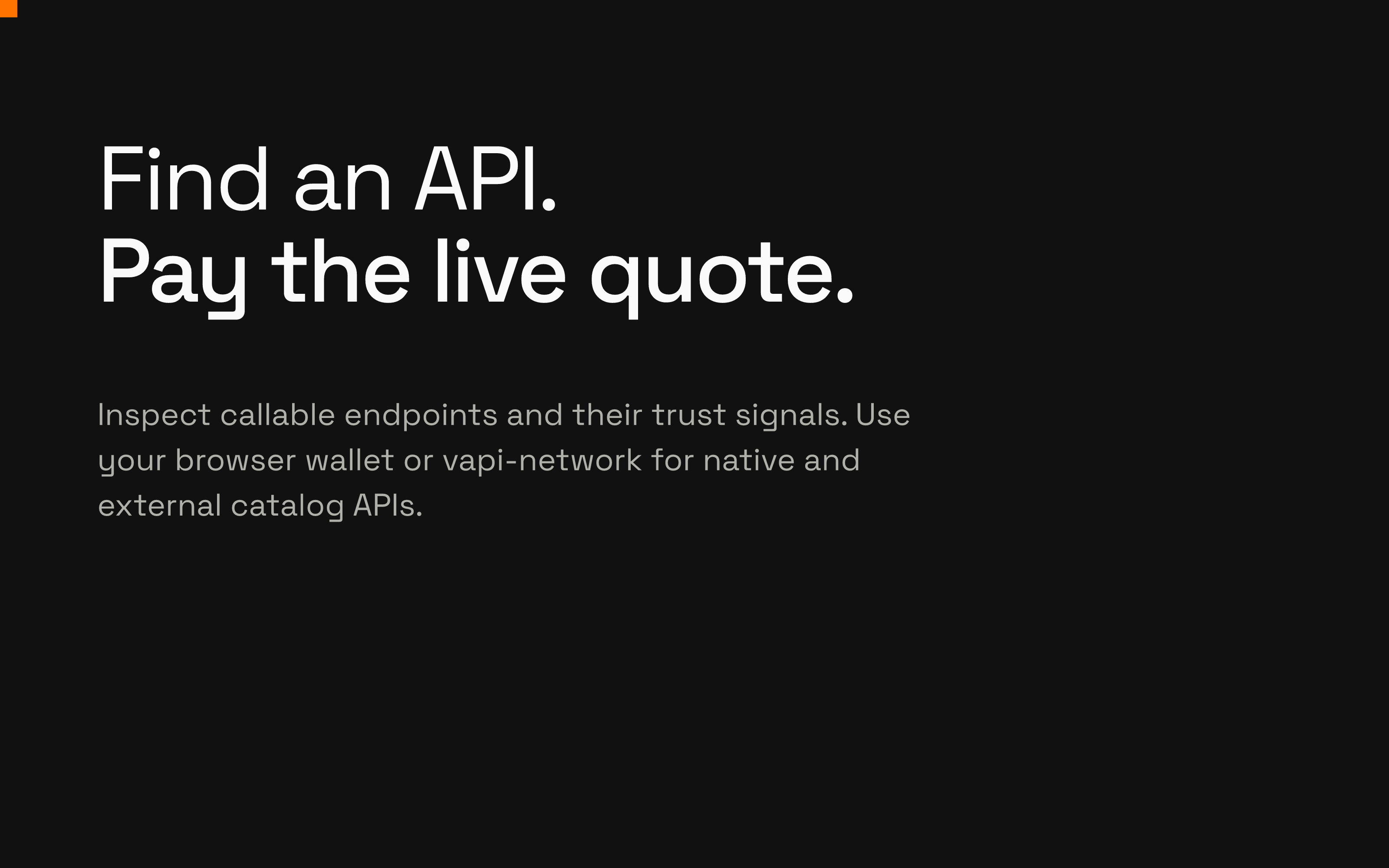
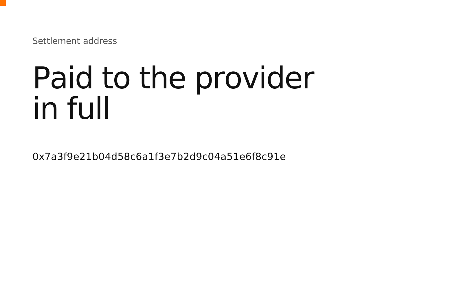
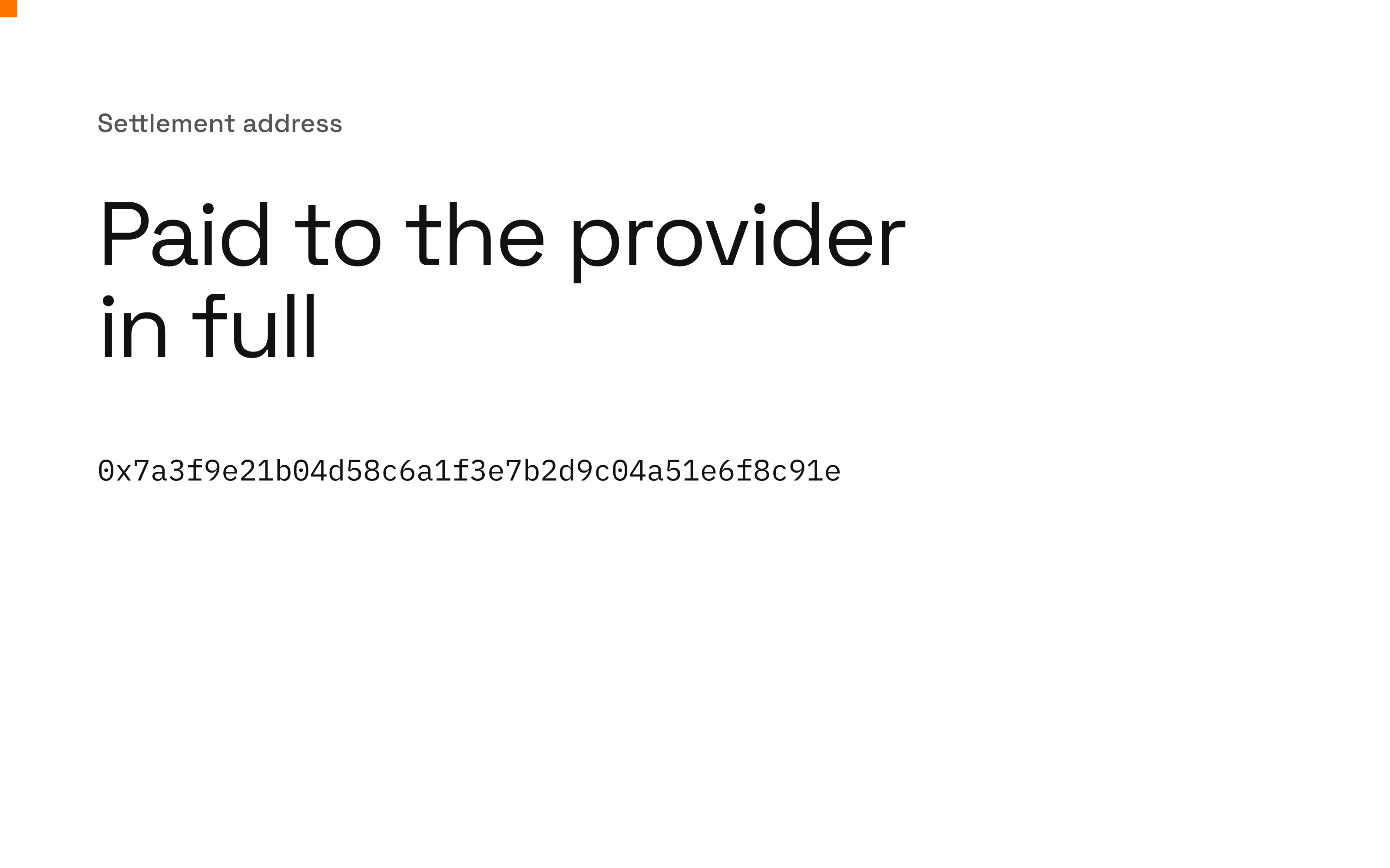
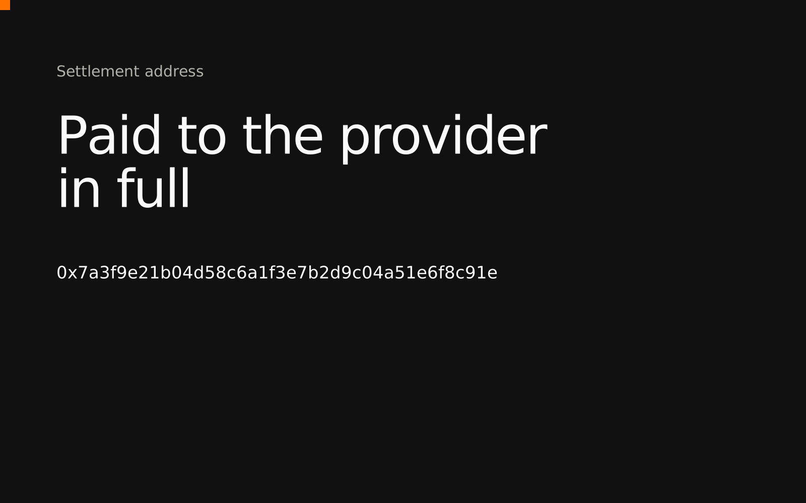
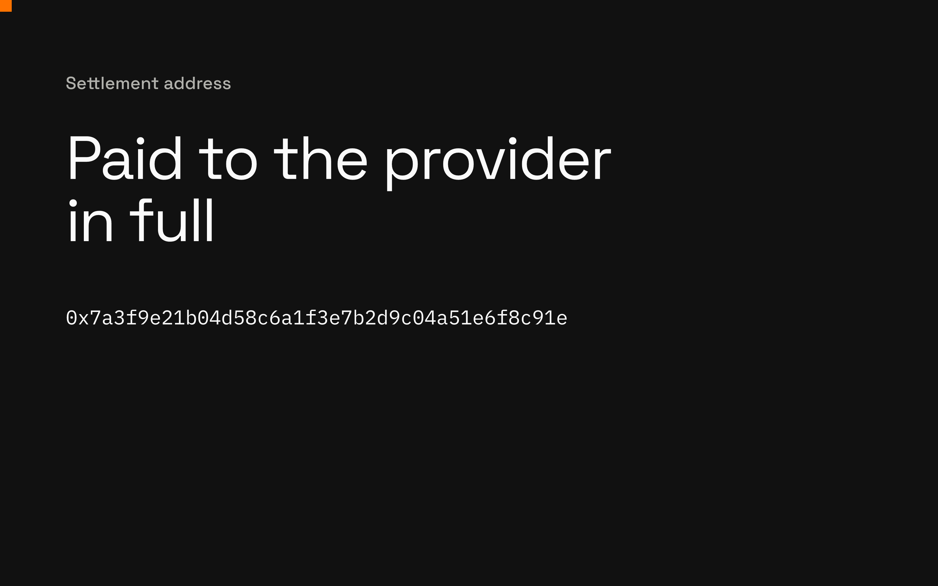
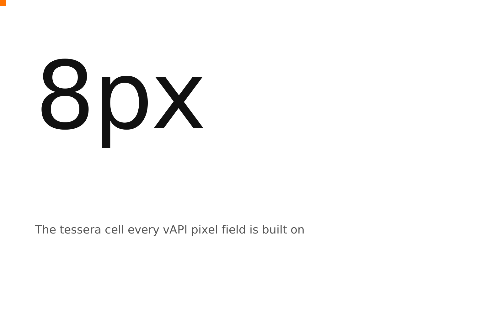
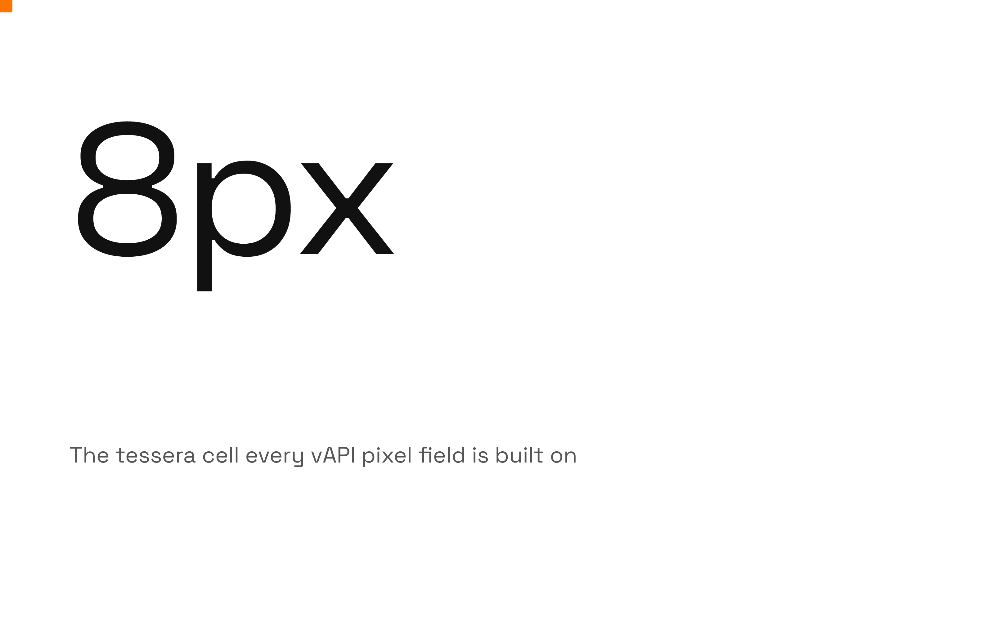
The four combinations the system allows. Each is available as an editable SVG and a PNG on light and dark.
Find an API. Pay the live quote.
Inspect callable endpoints and their trust signals. Use your browser wallet or vapi-network for native and external catalog APIs.


Settlement address
Paid to the provider in full
0x7a3f9e21b04d58c6a1f3e7b2d9c04a51e6f8c91e
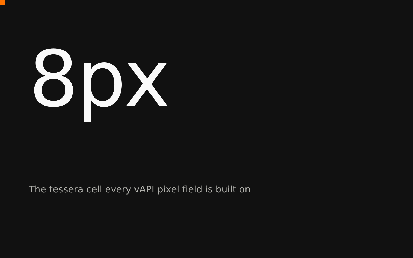
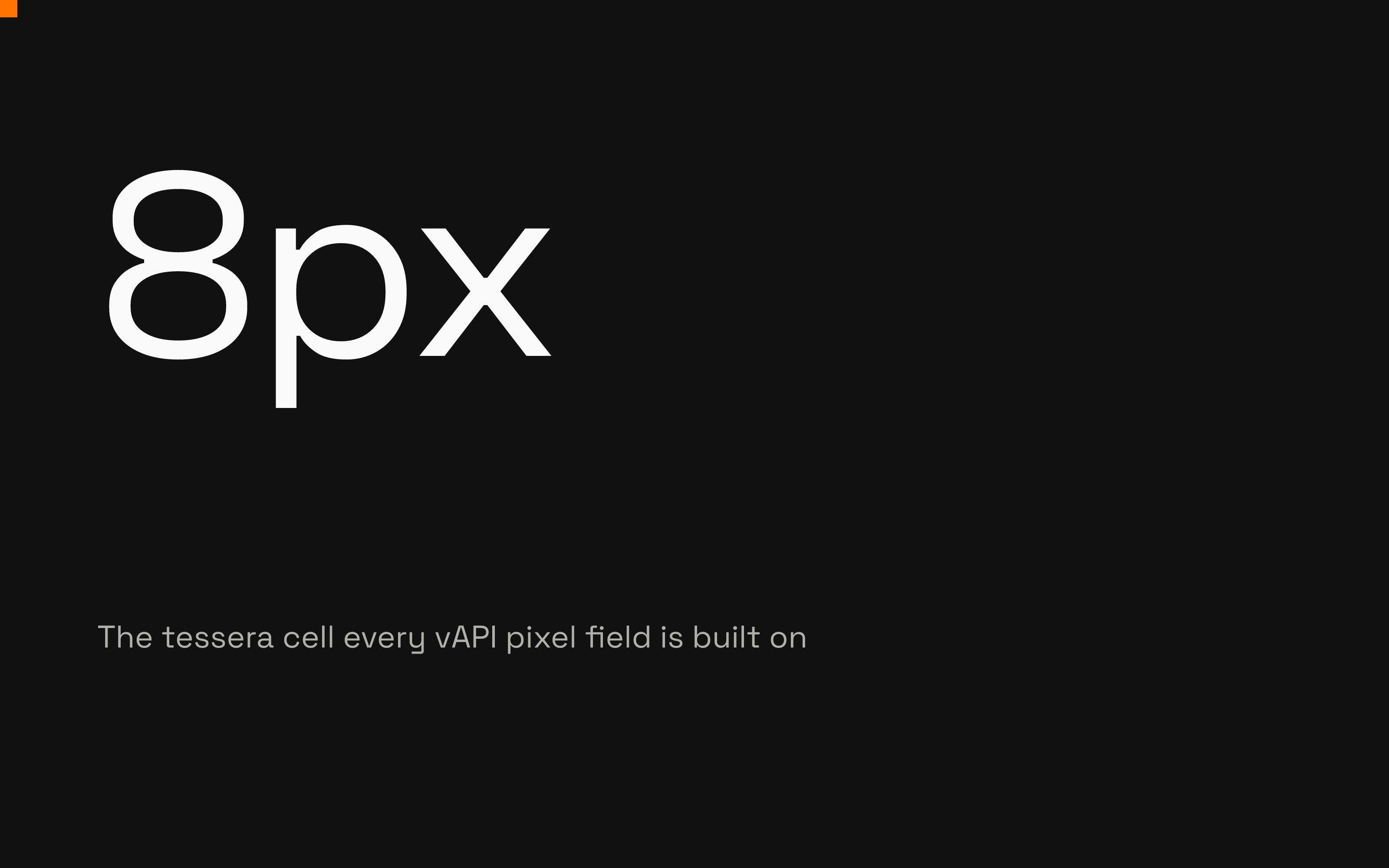
8px
The tessera cell every vAPI pixel field is built on
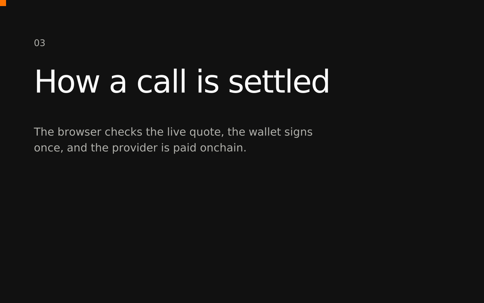
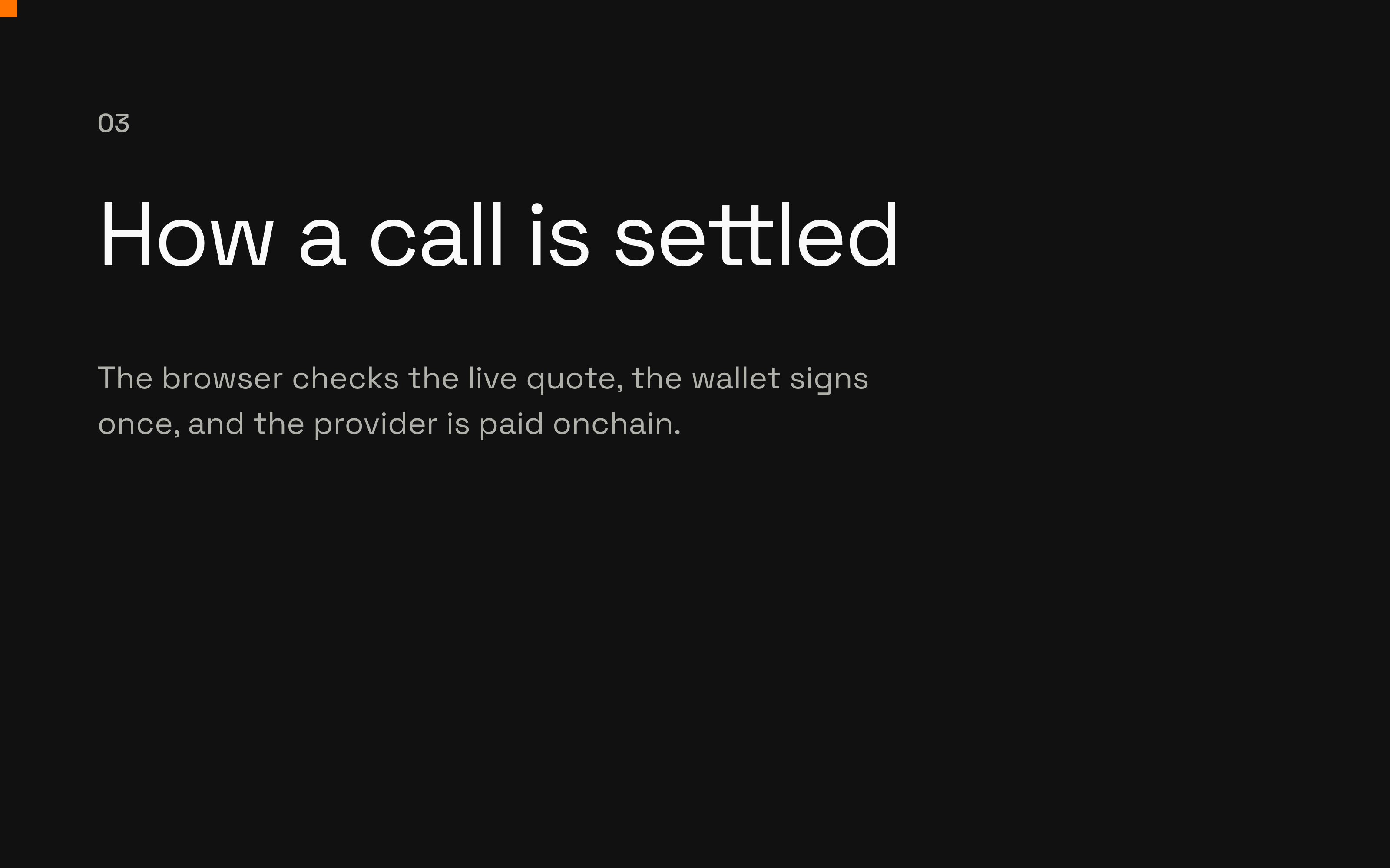
03
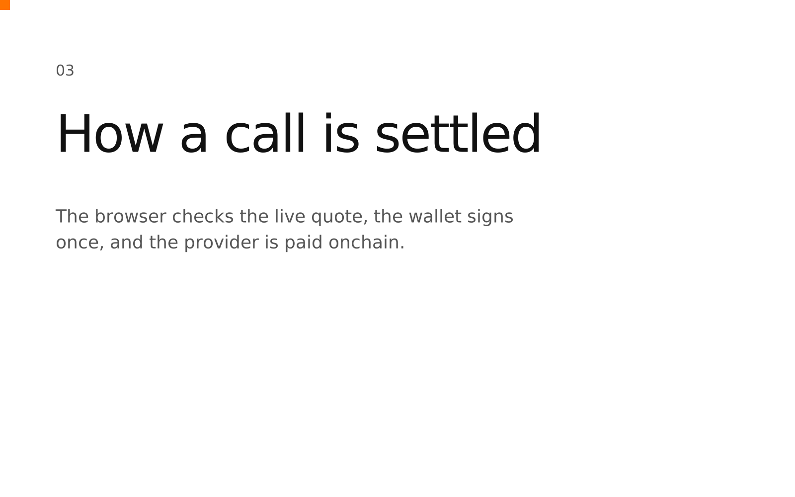
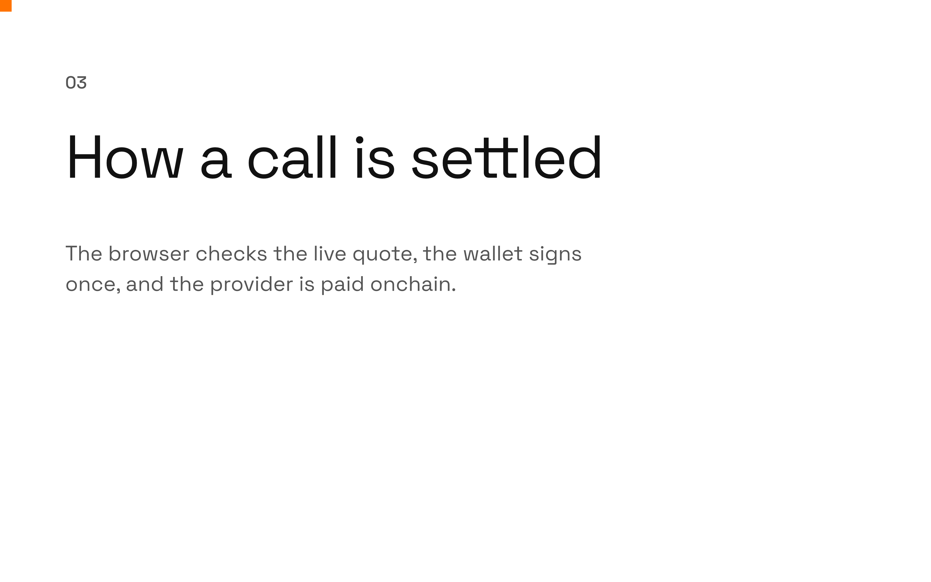
How a call is settled
The browser checks the live quote, the wallet signs once, and the provider is paid onchain.
07 Pixel system
The tessera grid
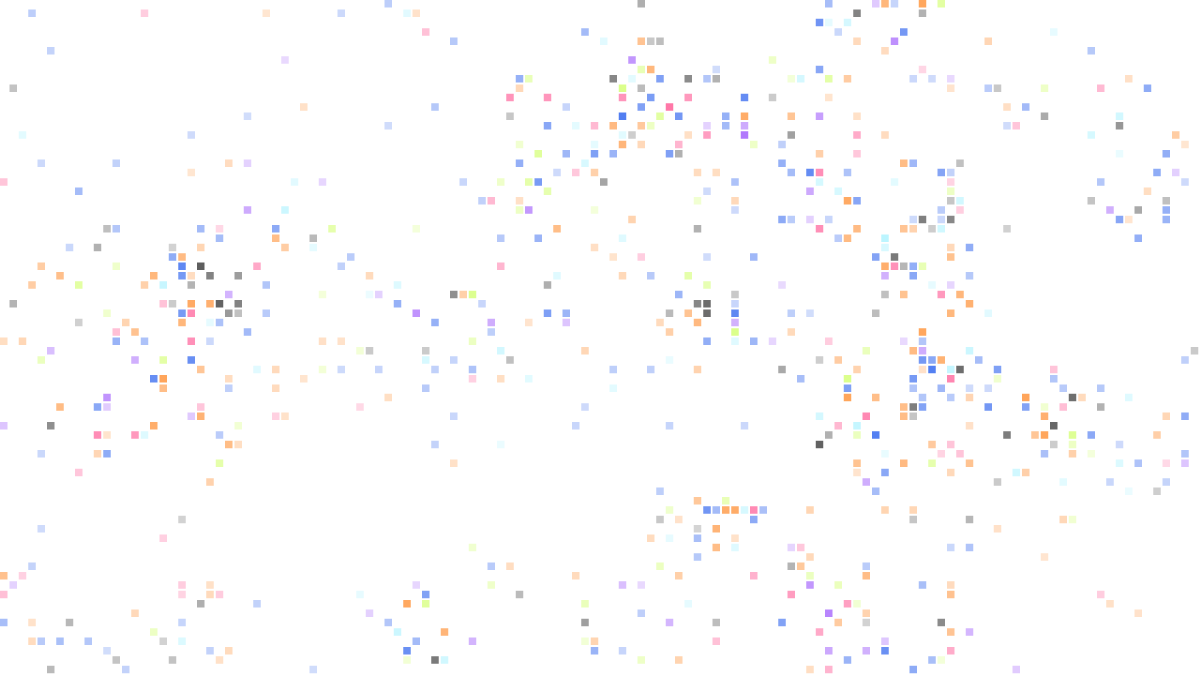
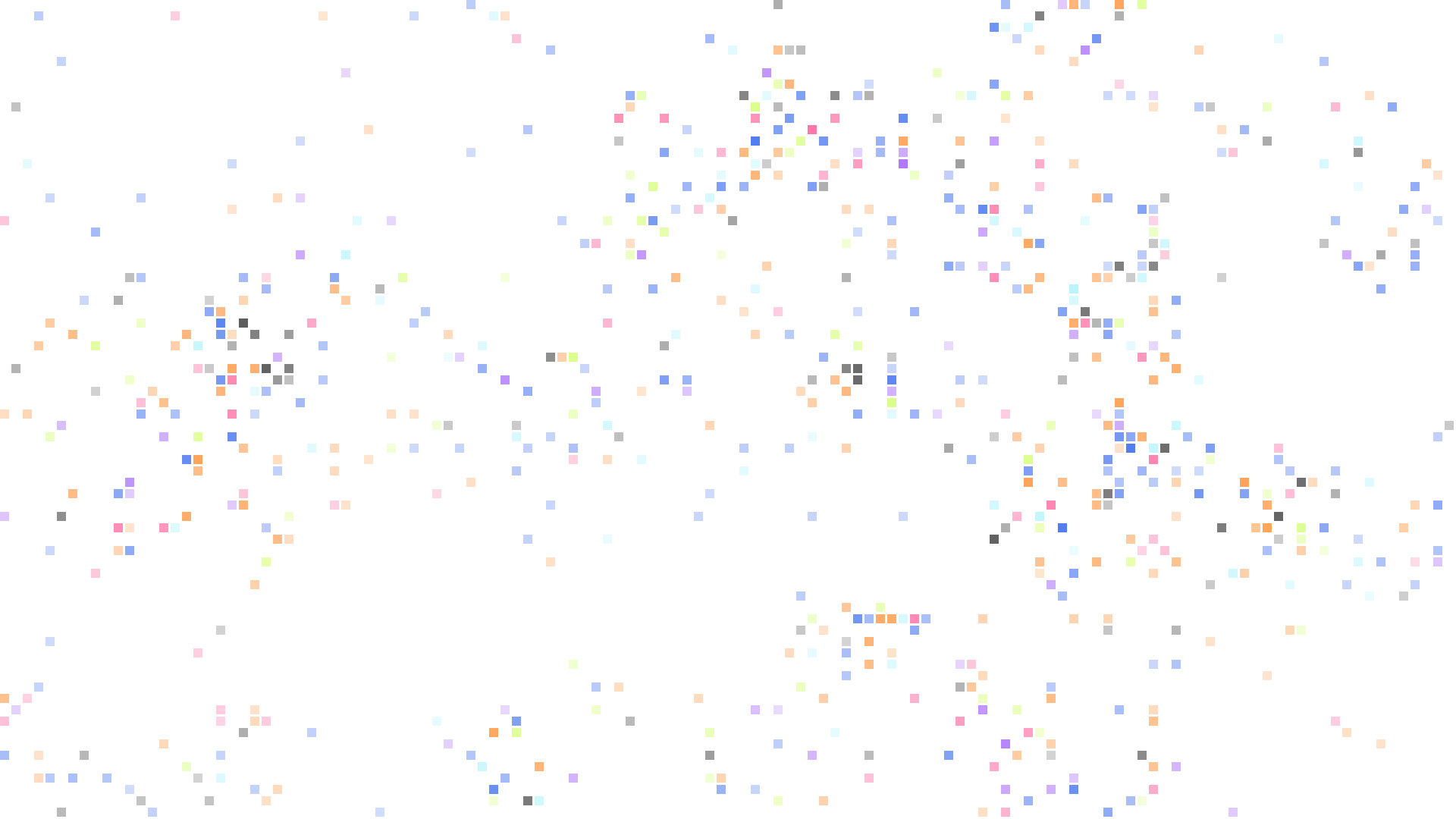
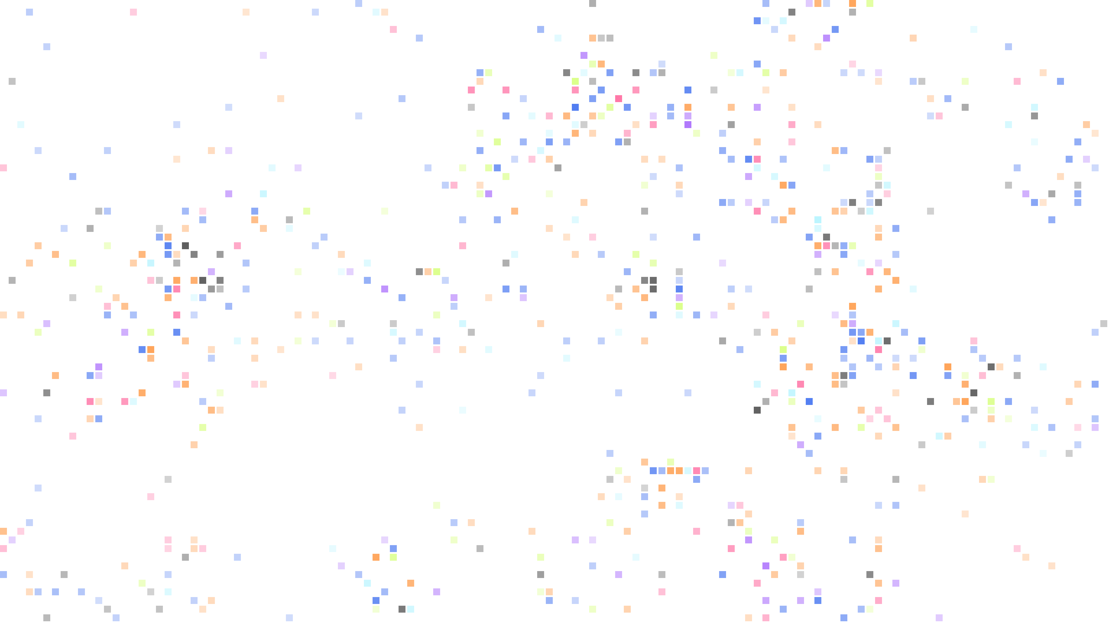
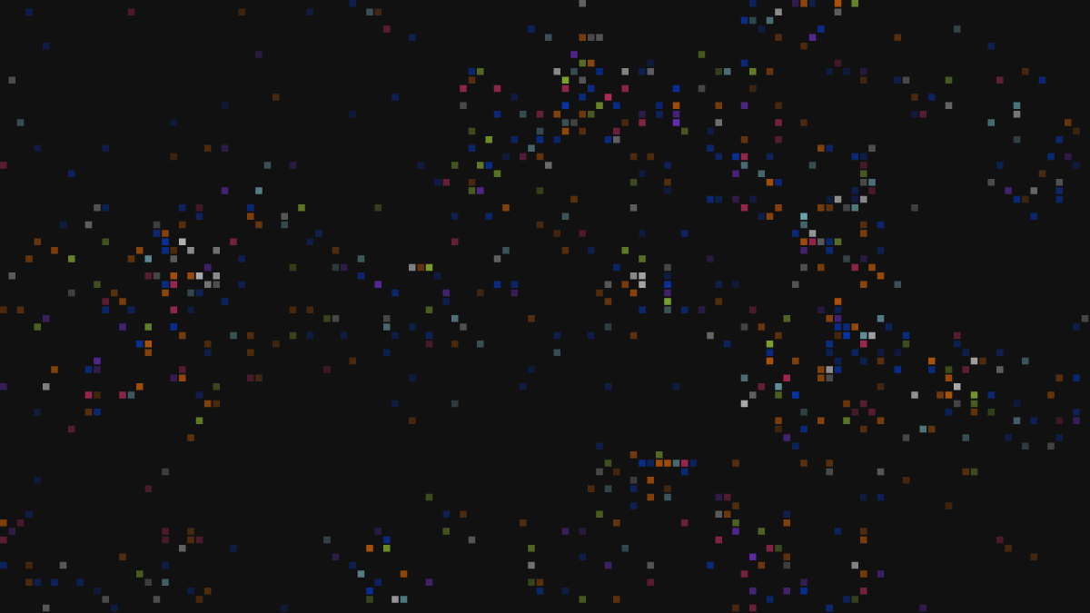
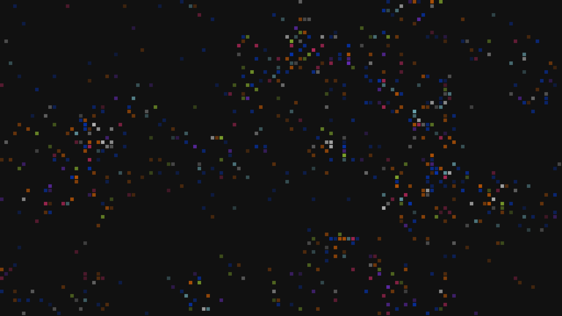
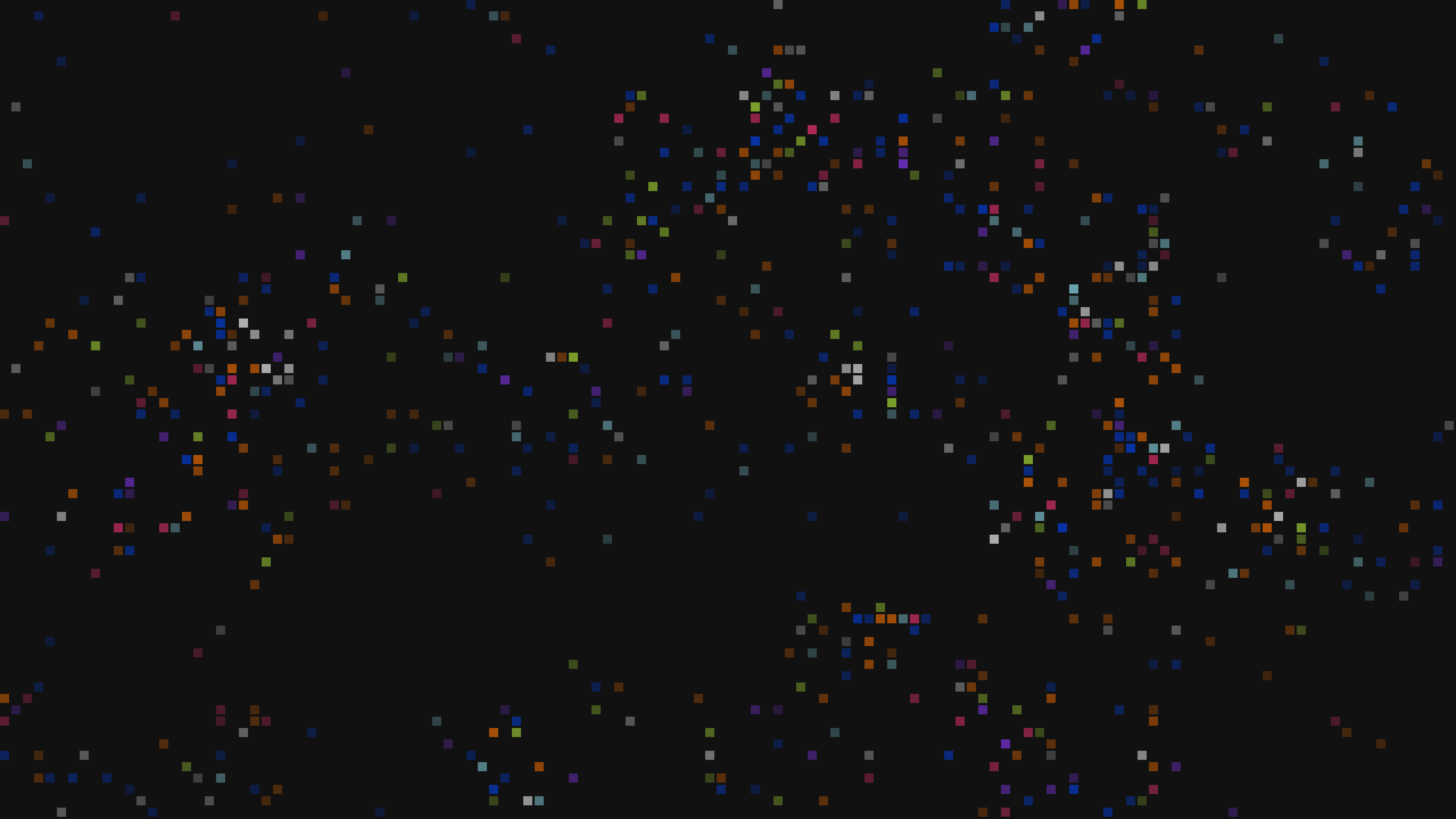
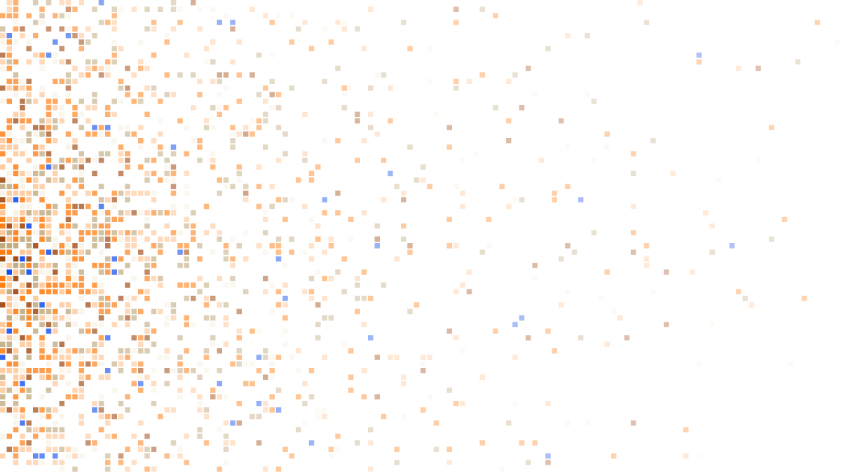
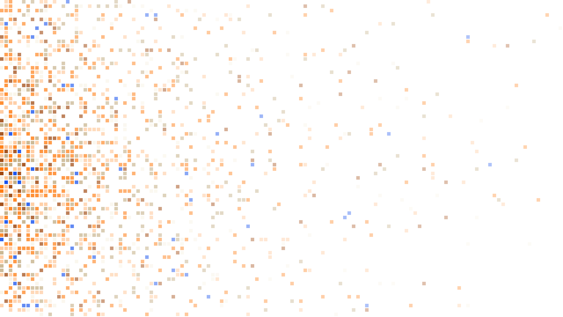
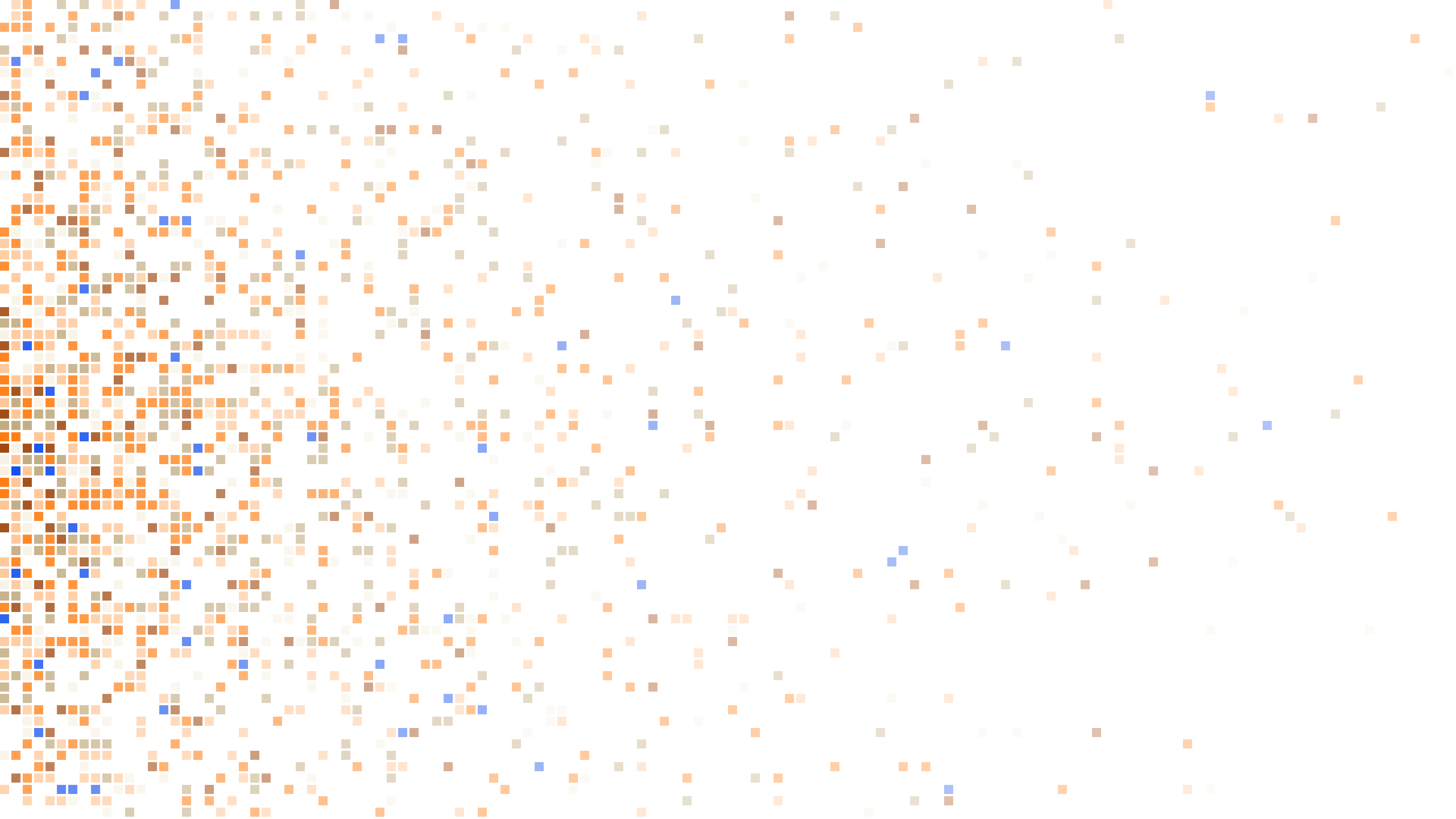
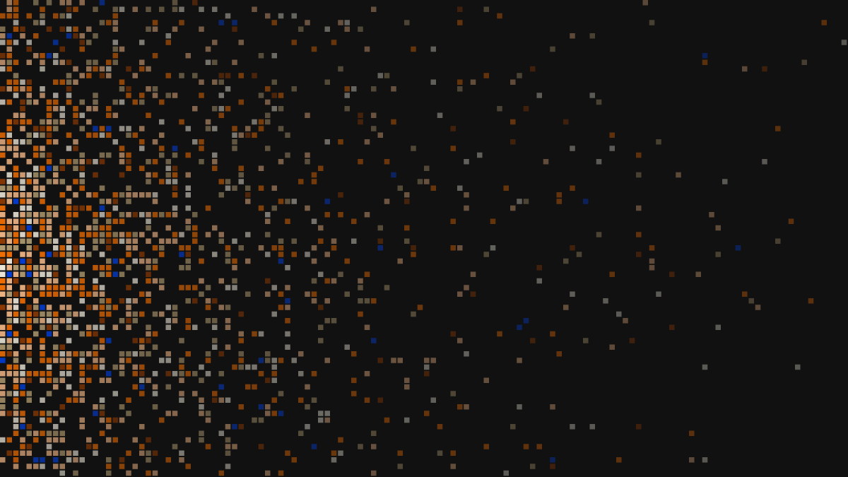
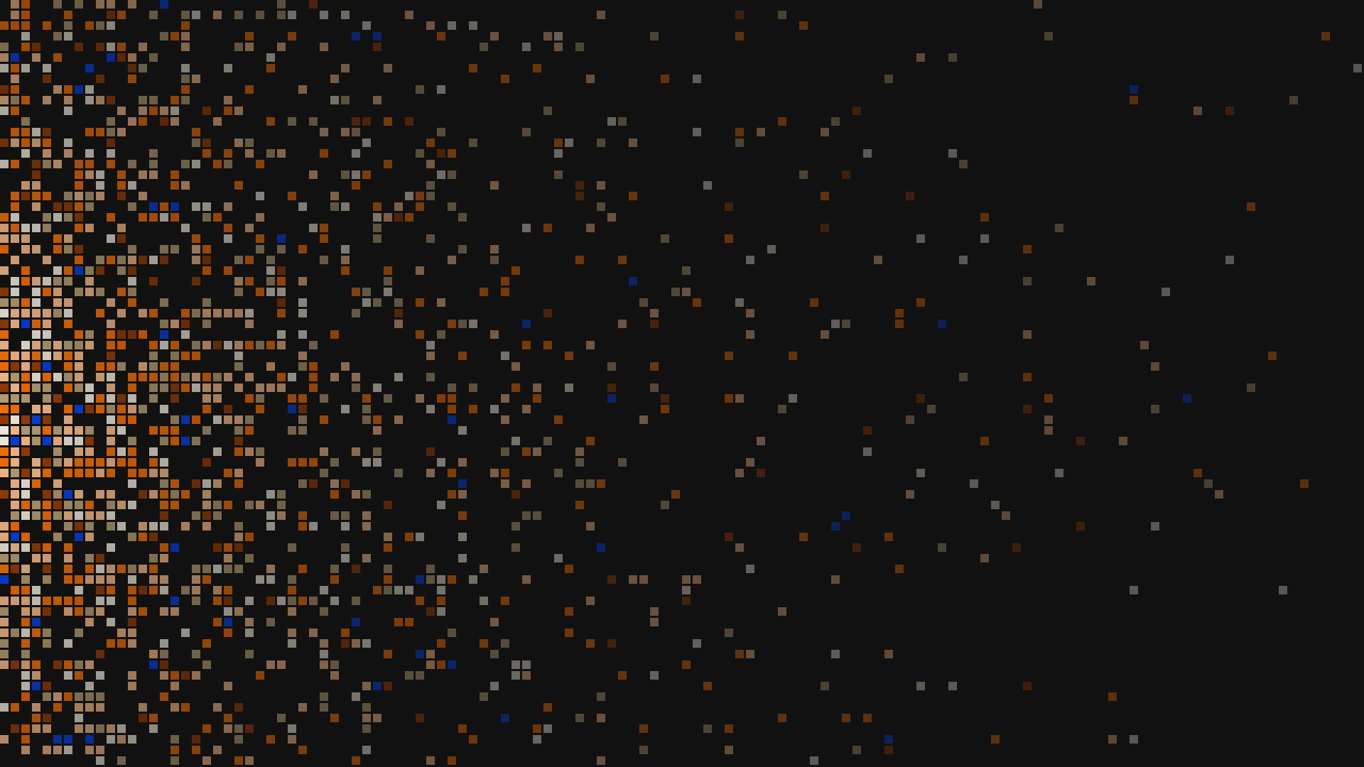
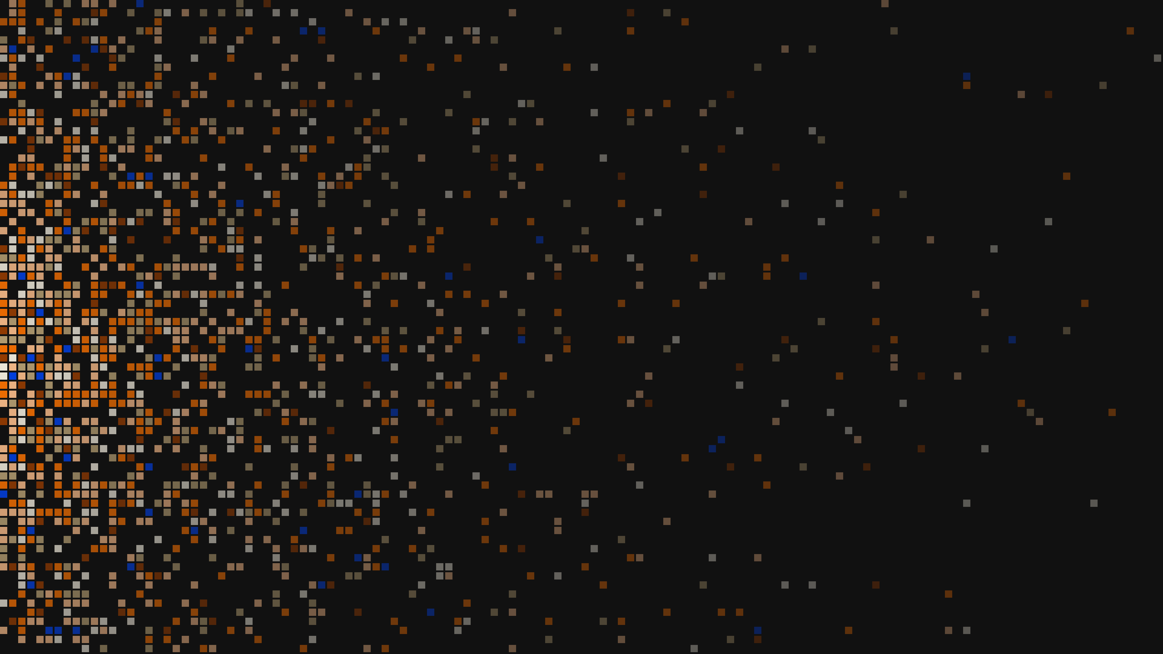
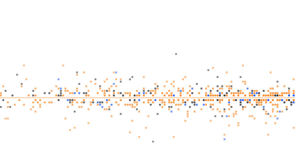
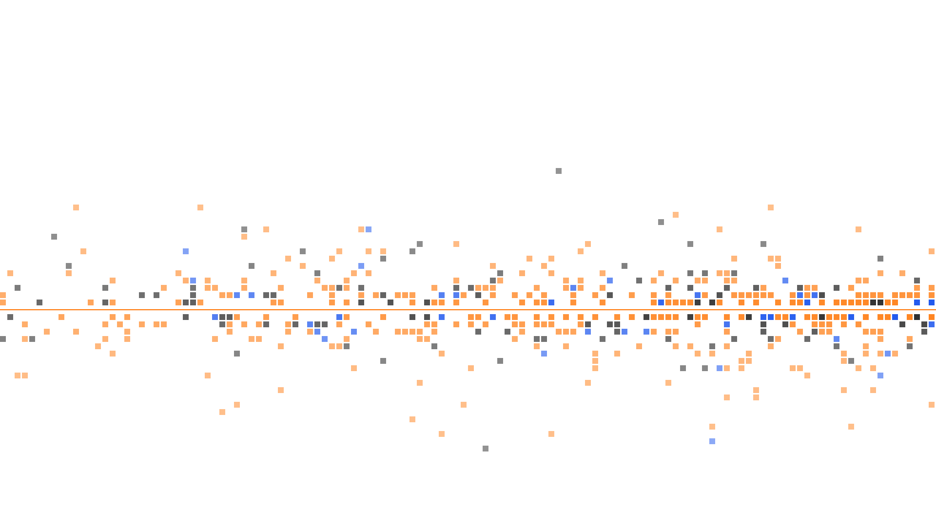
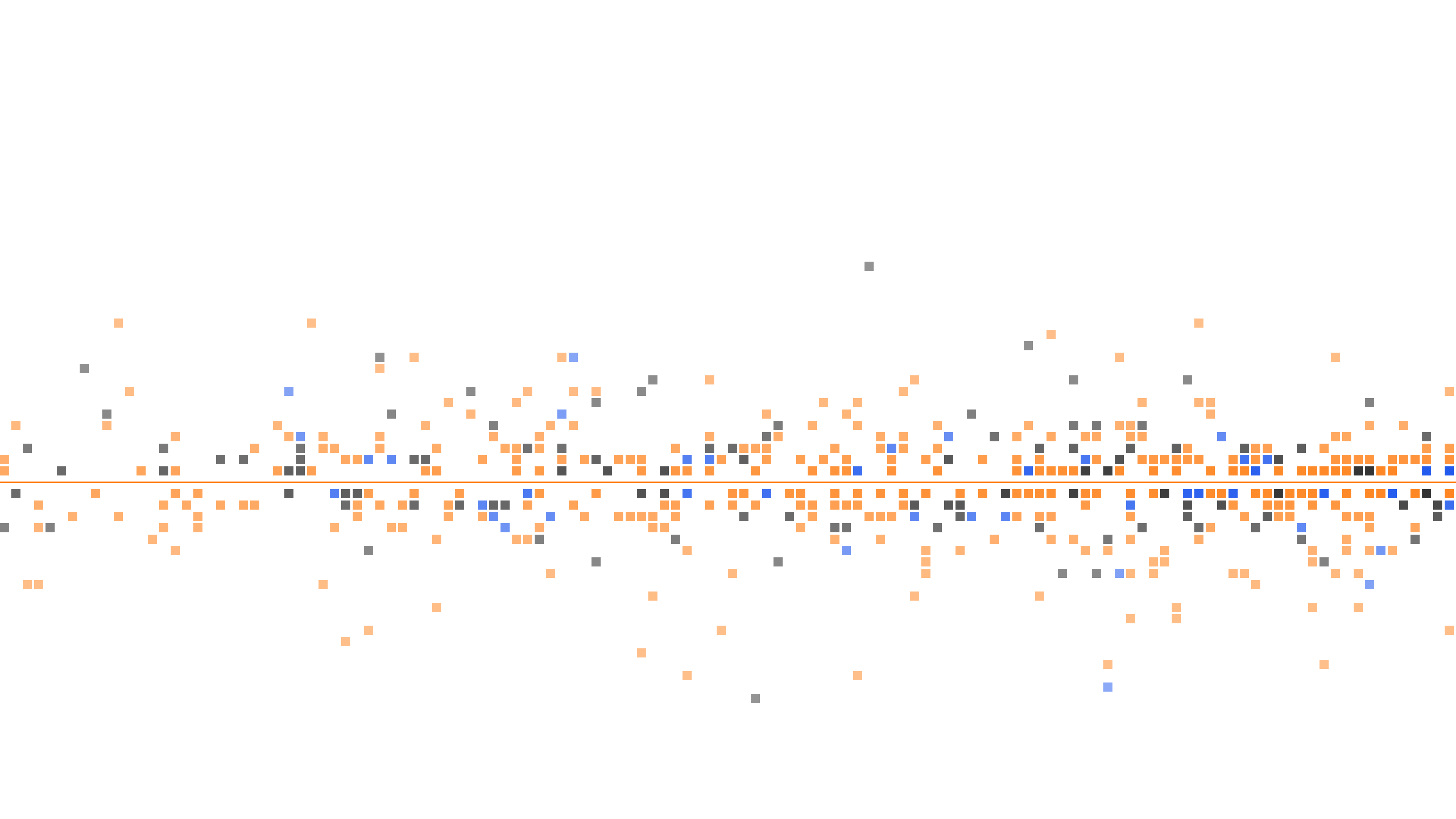
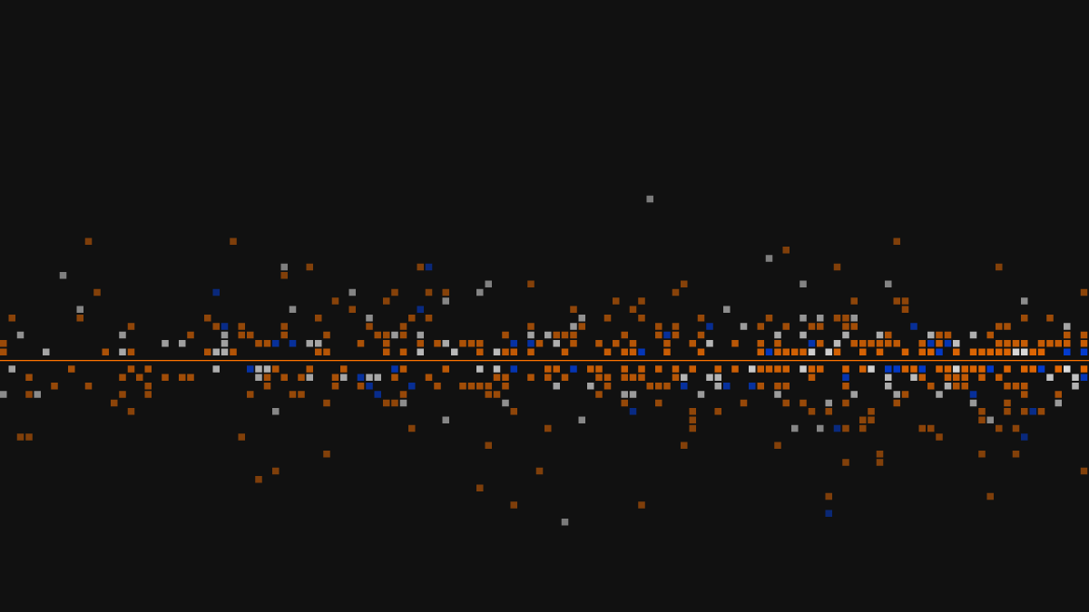
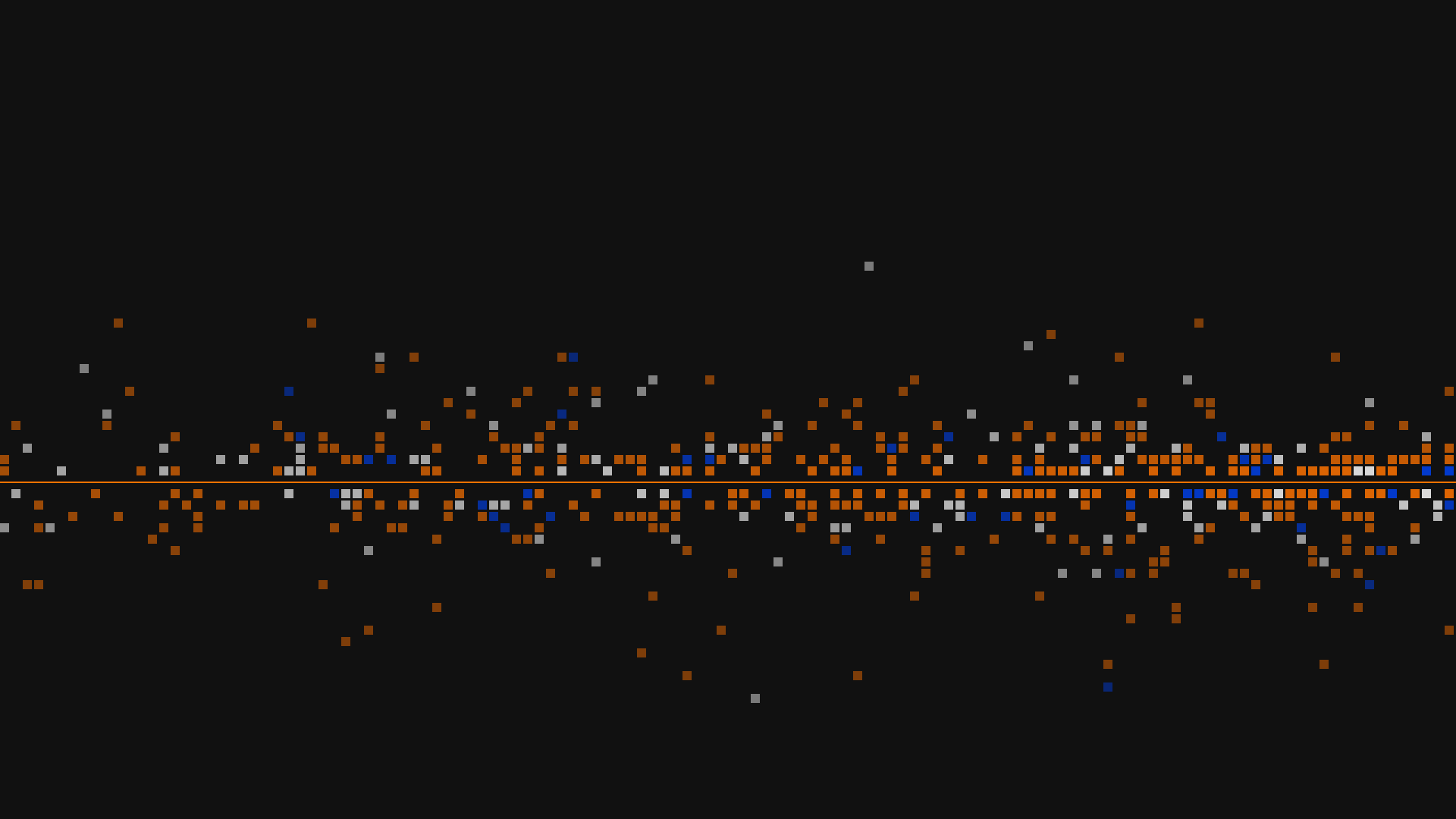
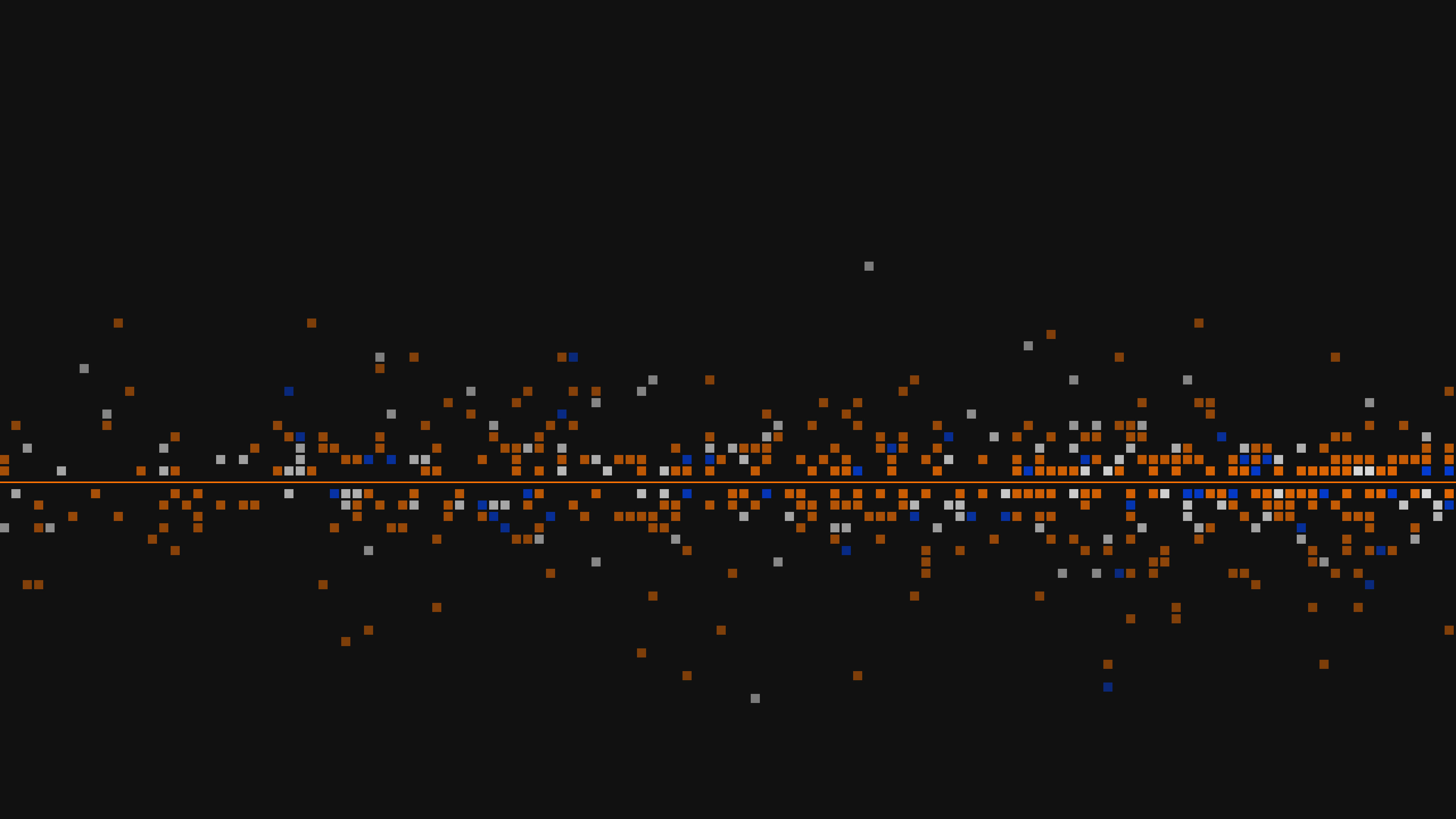
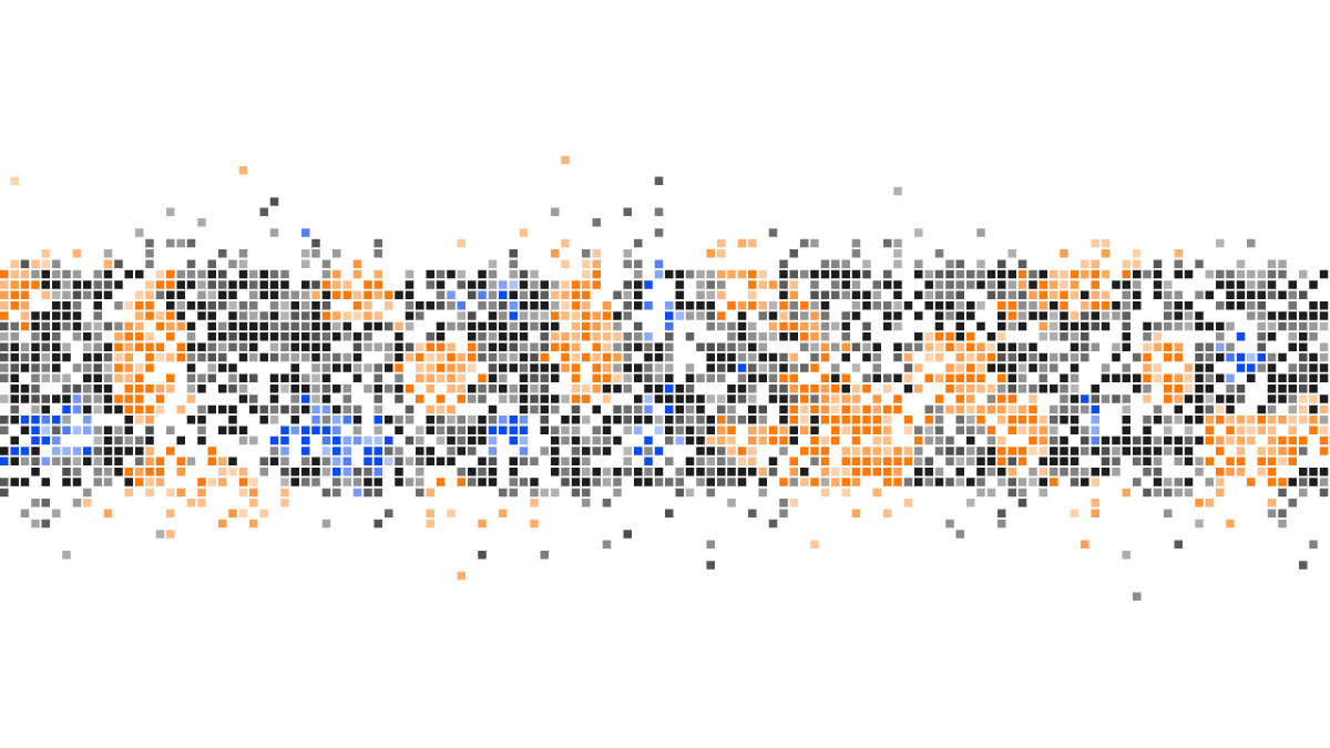
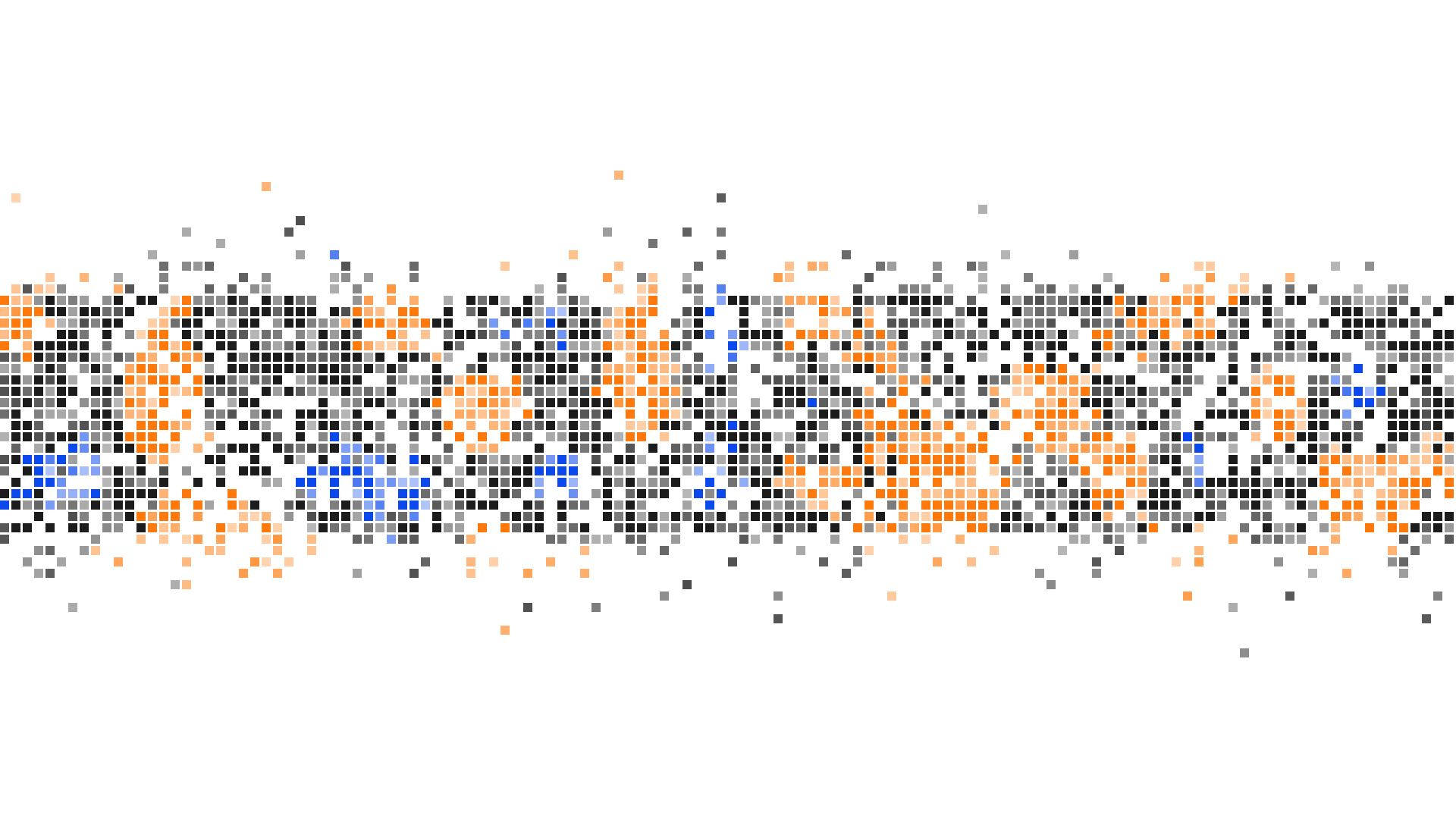
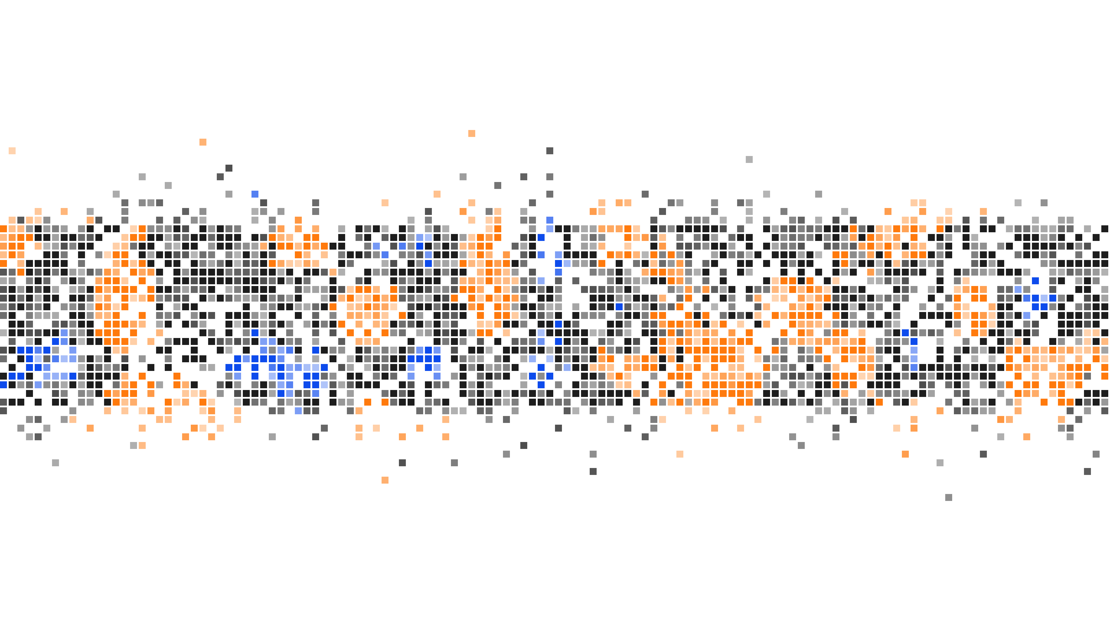
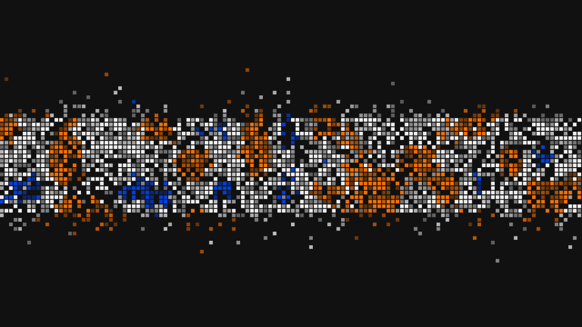
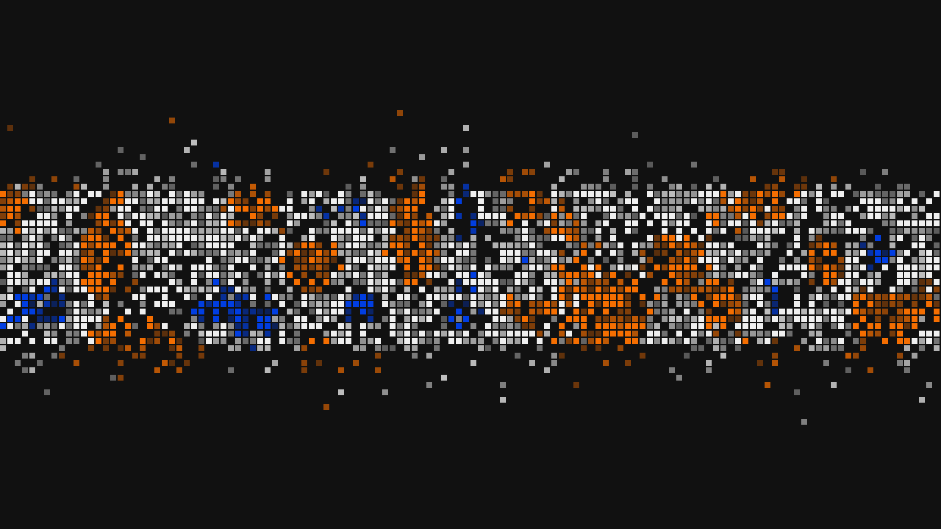
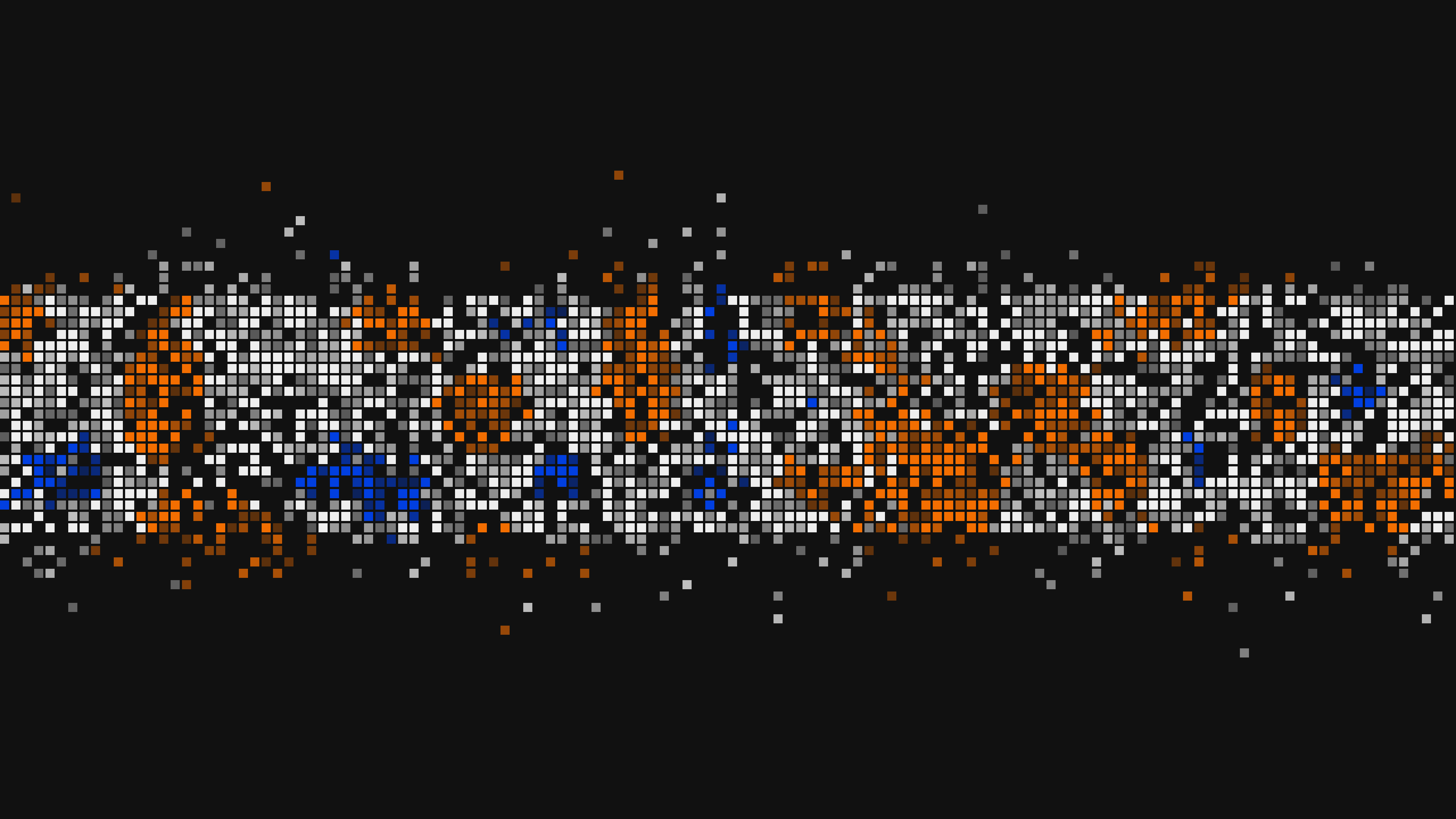
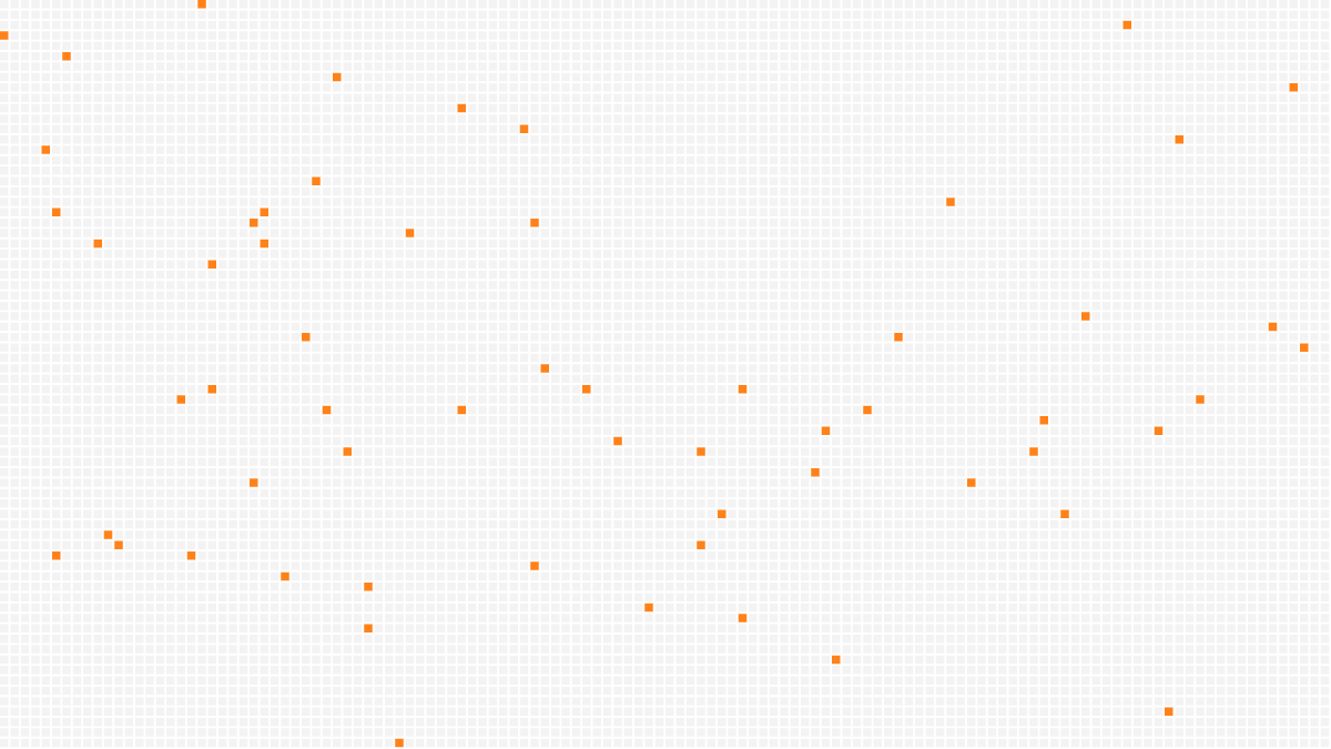
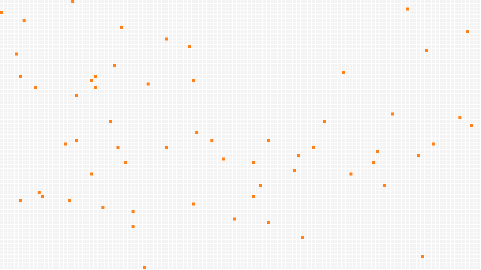
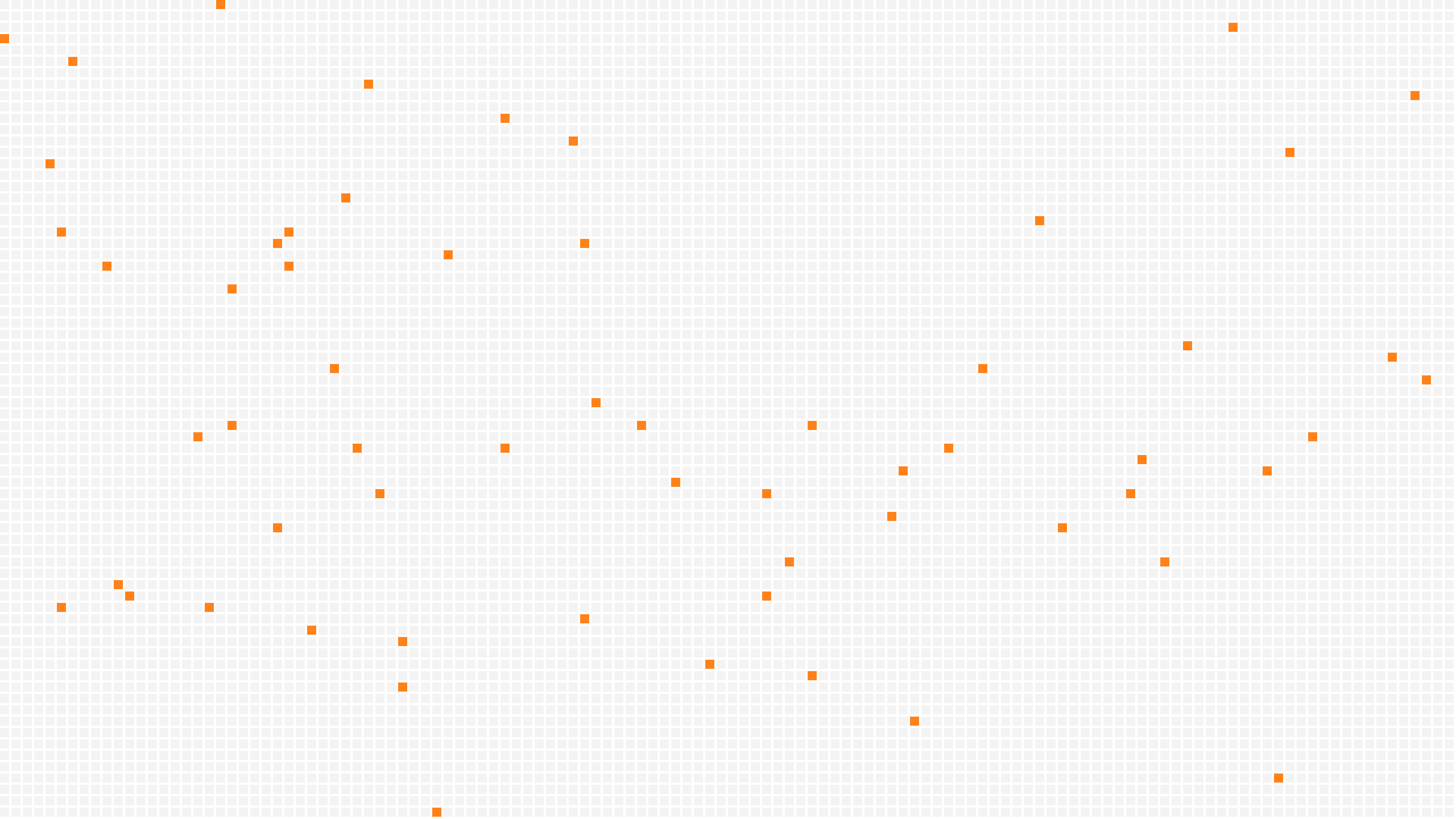
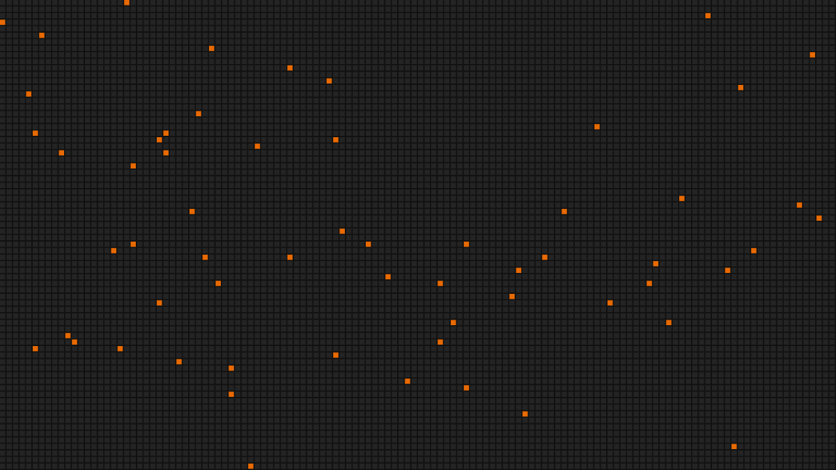
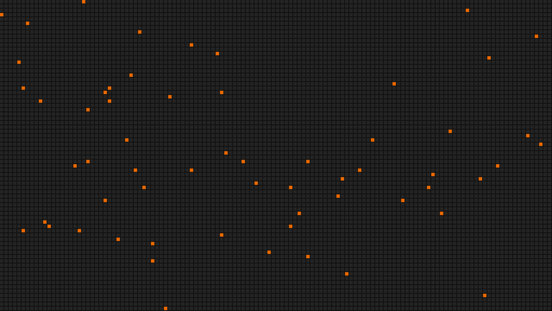
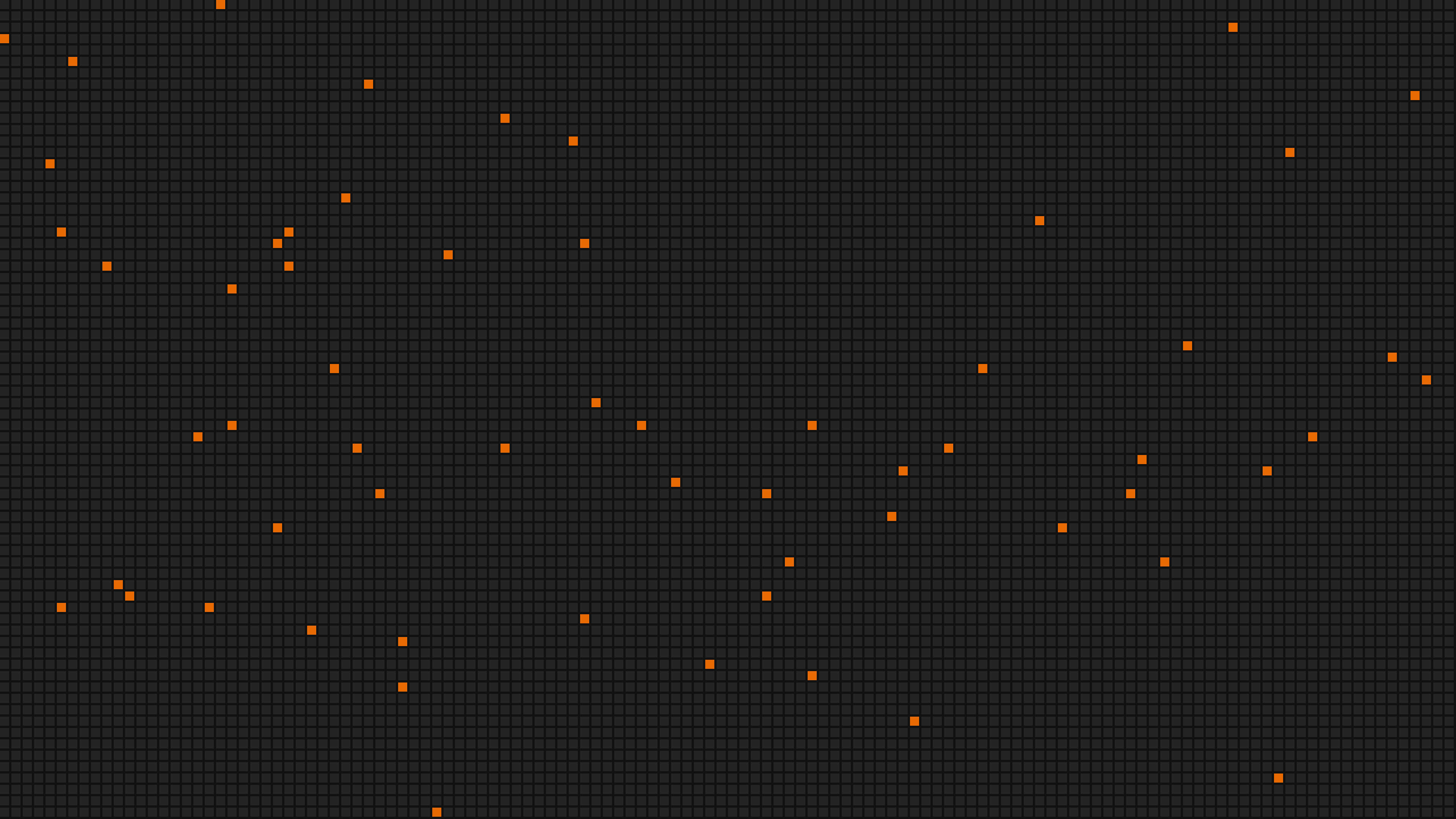
Every vAPI pixel lives on one grid: 8px squares with 2px gaps in the product. At any other scale, keep the same 4 to 1 ratio of cell to gap.
- Every pixel is a square tessera on the grid. It never rotates, rounds, blurs, or glows.
- Fields are denser near their subject and disperse outward, so they read as built, not scattered.
- Light grounds get the full accent set. Warm stone tones are for illustration.
- A field never sits behind body text. Give type a clear lane.
08 Motion
Pixels that assemble, settle, and travel
Seamless 6 second loops at 30fps and 1920x1080, rendered from the same patterns as the stills. Each comes as MP4 on light and dark, and as a transparent WebM for compositing over your own footage.
Motion explains, it never decorates
Pixels assemble, settle, or travel along the rail to show what is happening. Nothing moves only to be noticed.
Short and decisive
Most interface motion runs 150 to 250ms, and no one-shot transition passes 800ms. Loops are the one exception: the boot mark cycles every 2 seconds, ambient fields every 6, and both close seamlessly.
Ease out on entry, ease in and out on exit
Entries use cubic-bezier(0.23, 1, 0.32, 1). Exits and lifts use cubic-bezier(0.77, 0, 0.175, 1). No bounce, no overshoot.
Blocks move on the grid
Squares fade and shift by whole grid steps. They never rotate, scale, blur, or glow.
Respect reduced motion
Every loop has a still state. When the viewer asks for reduced motion, show the still frame.
09 Composition
Layouts that start on brand
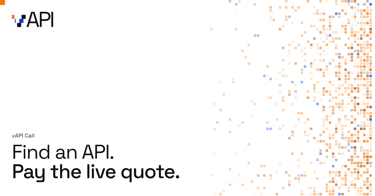
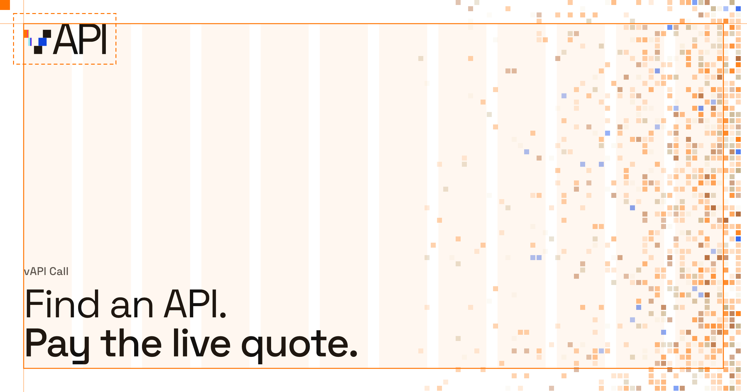
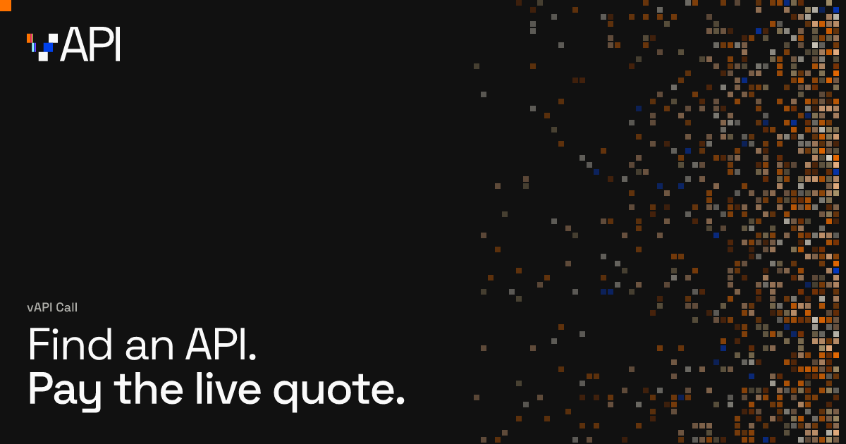
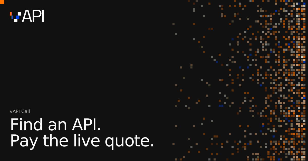
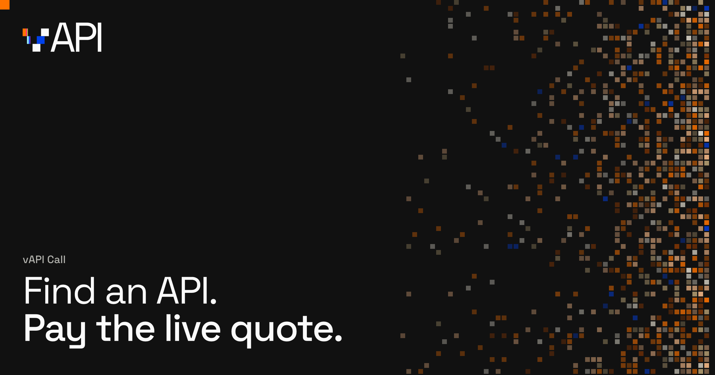
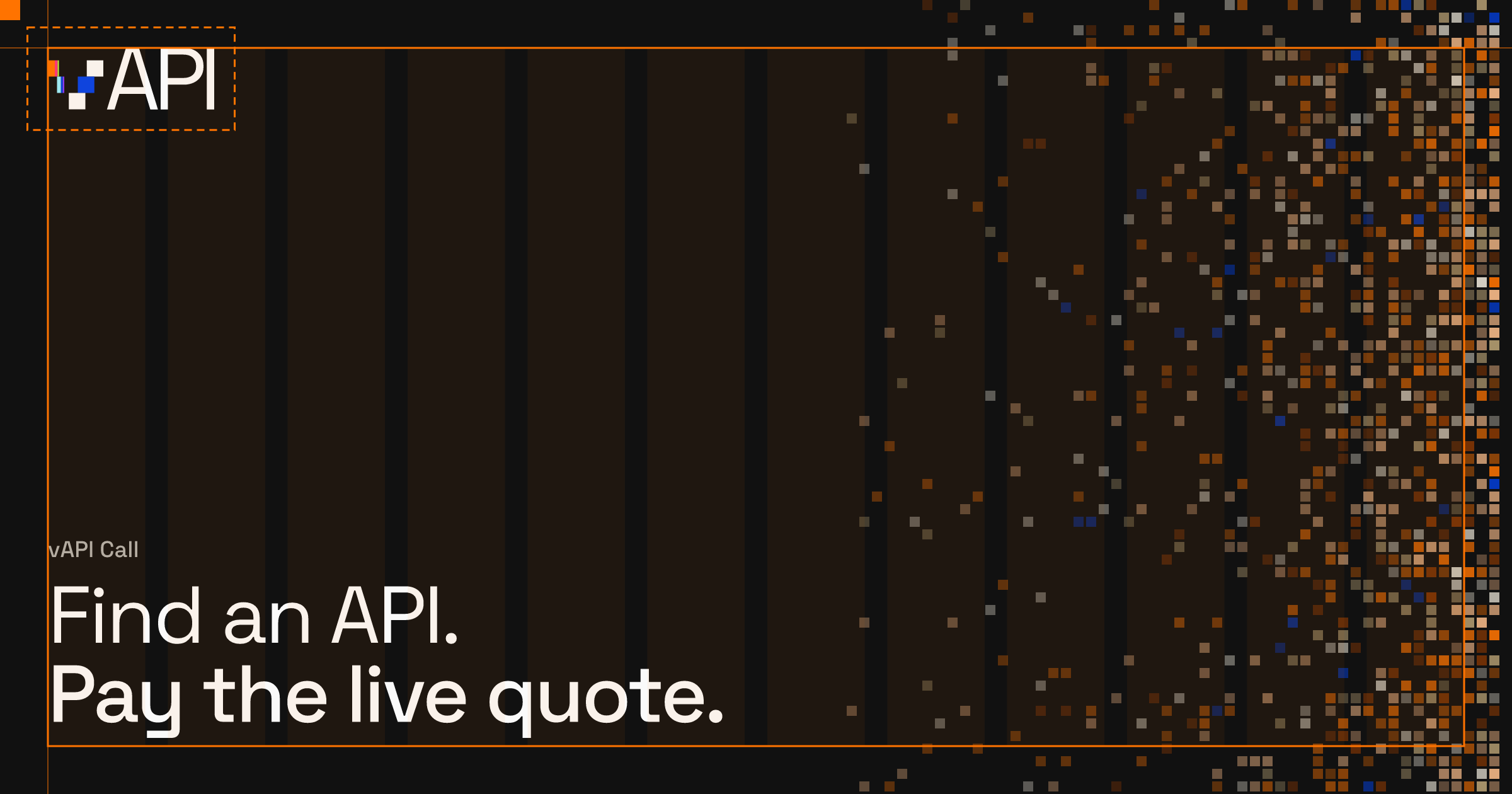
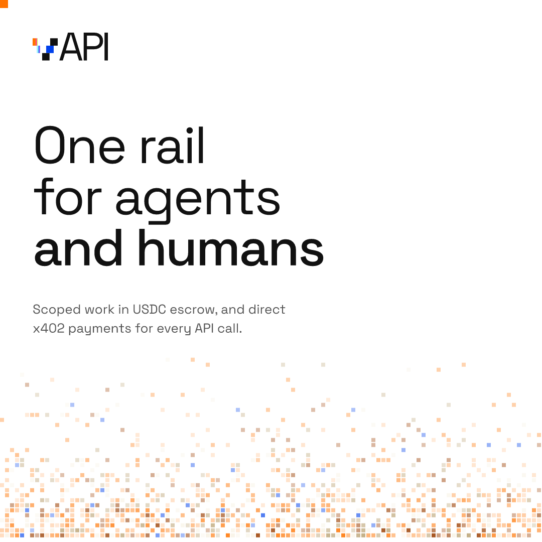
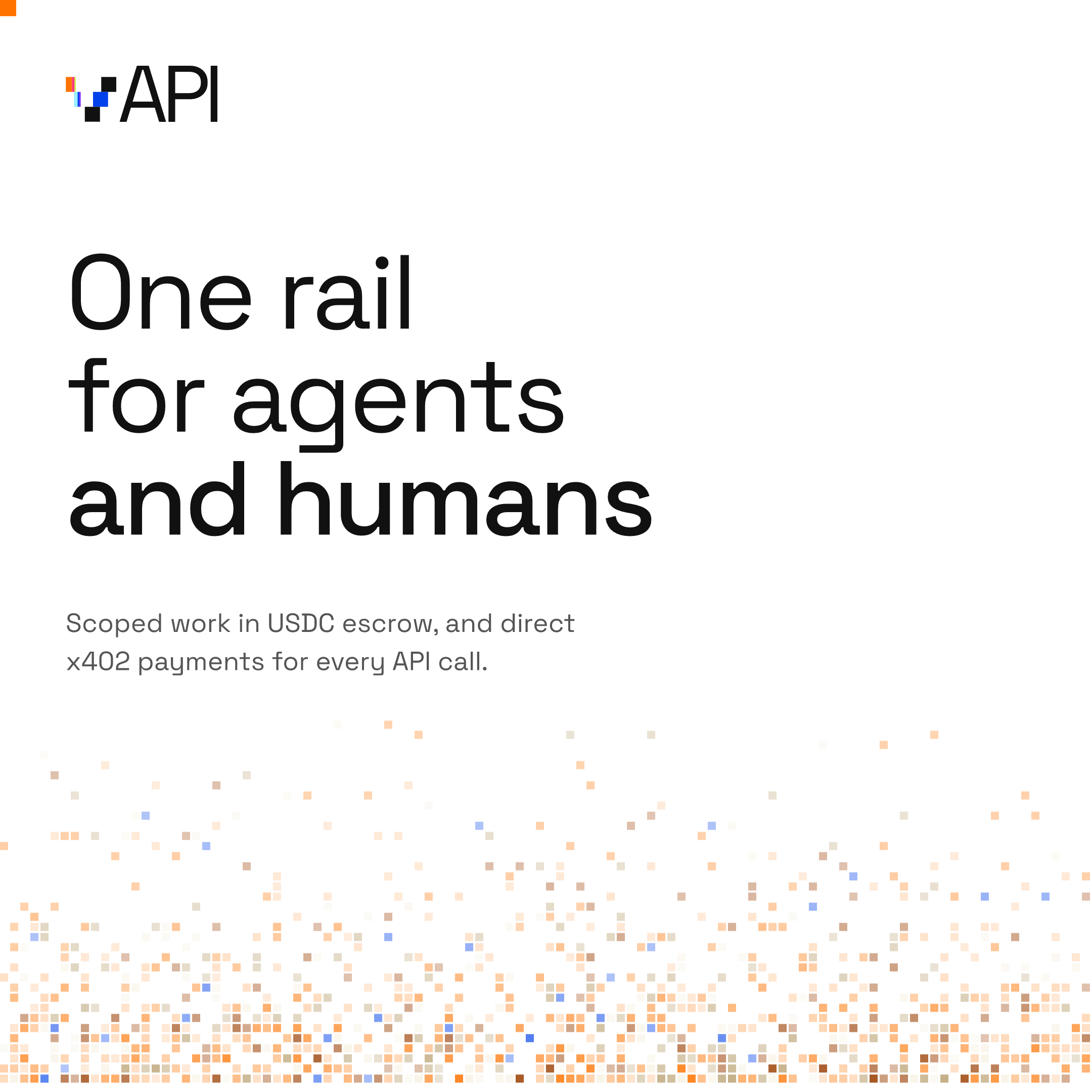
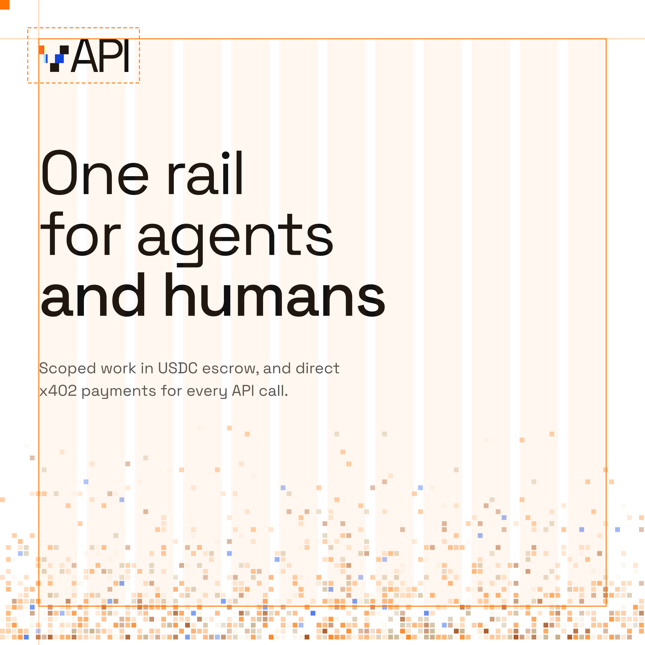
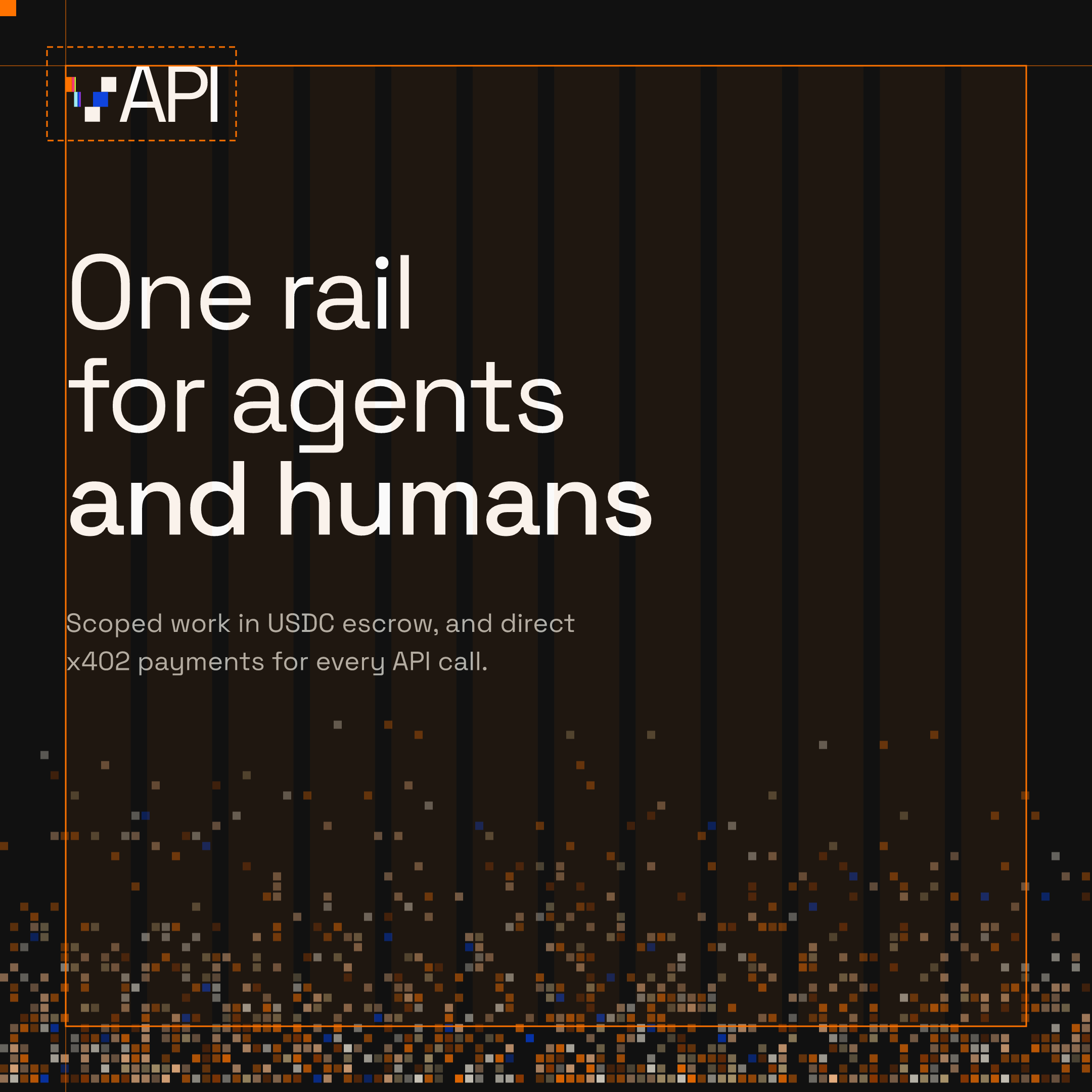
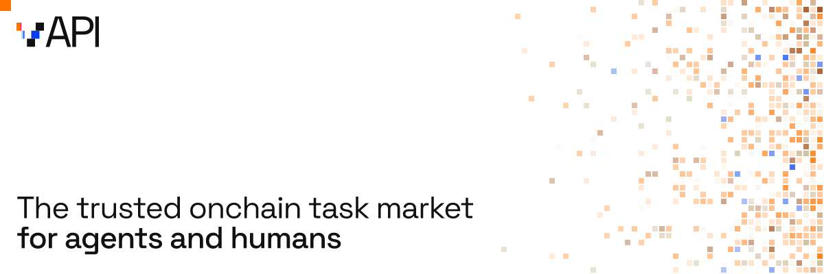
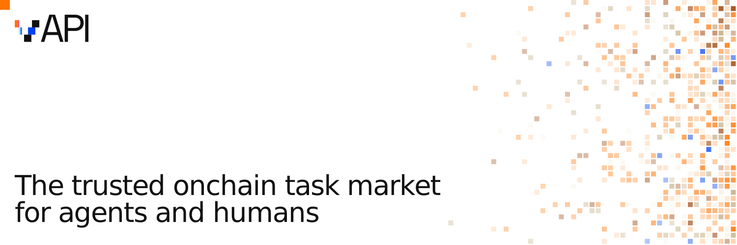
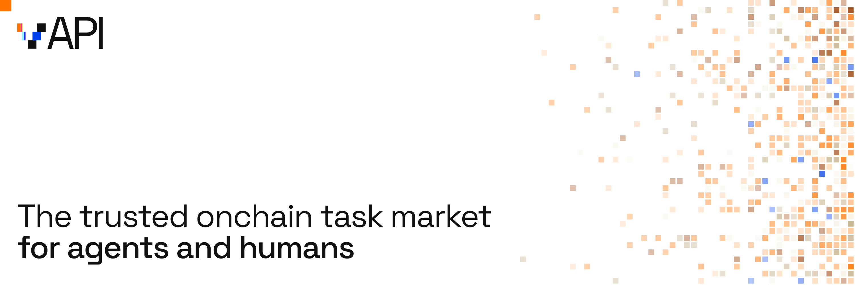
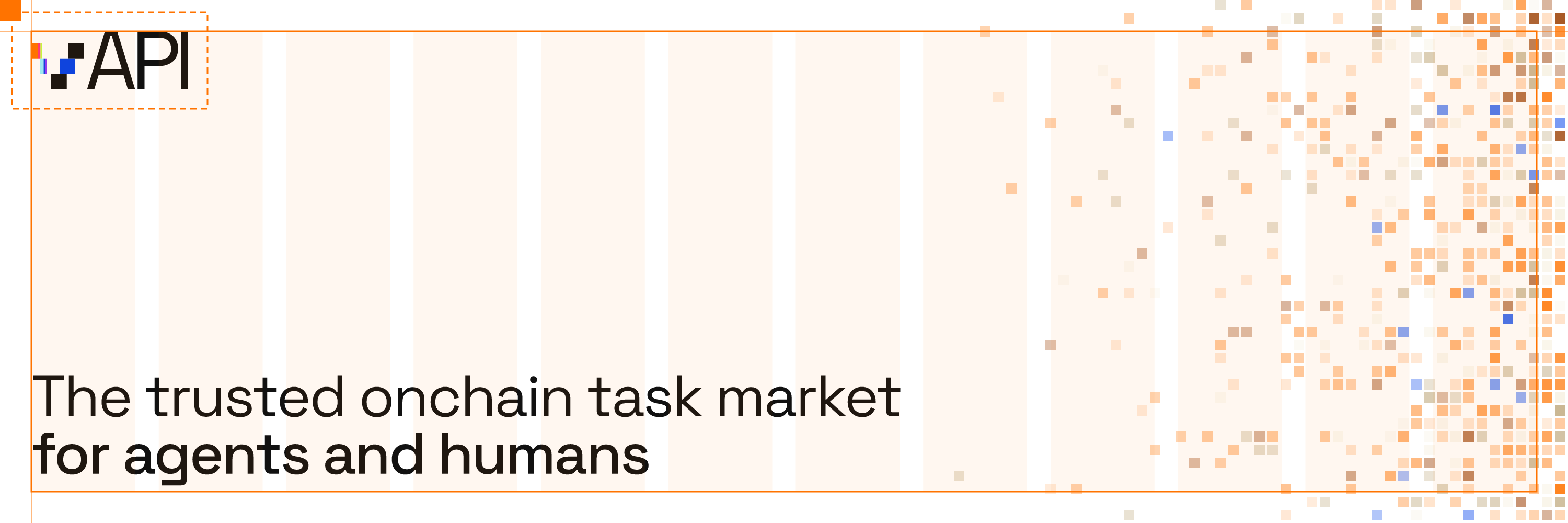
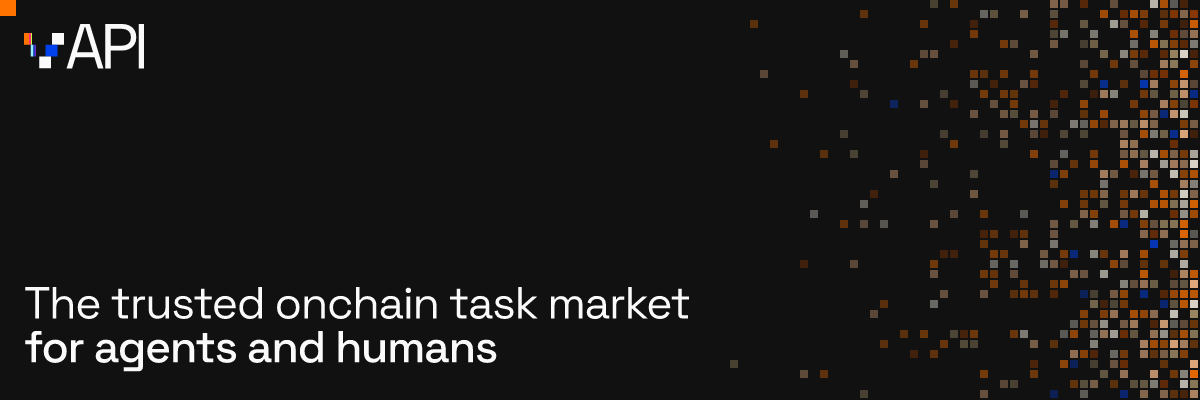
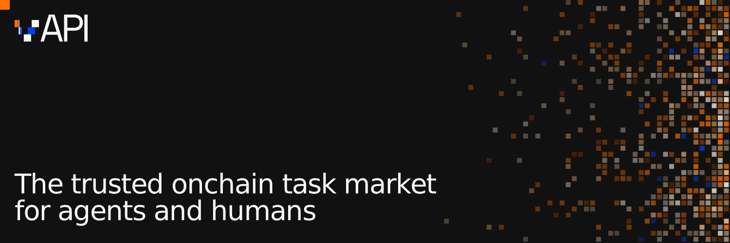
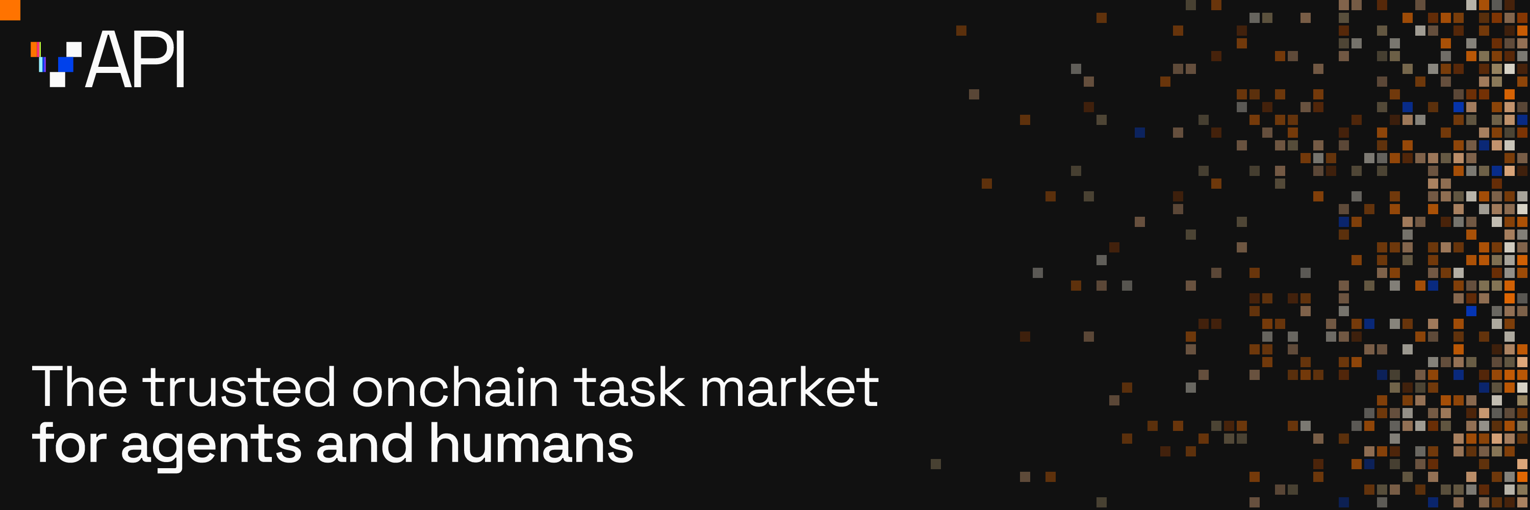
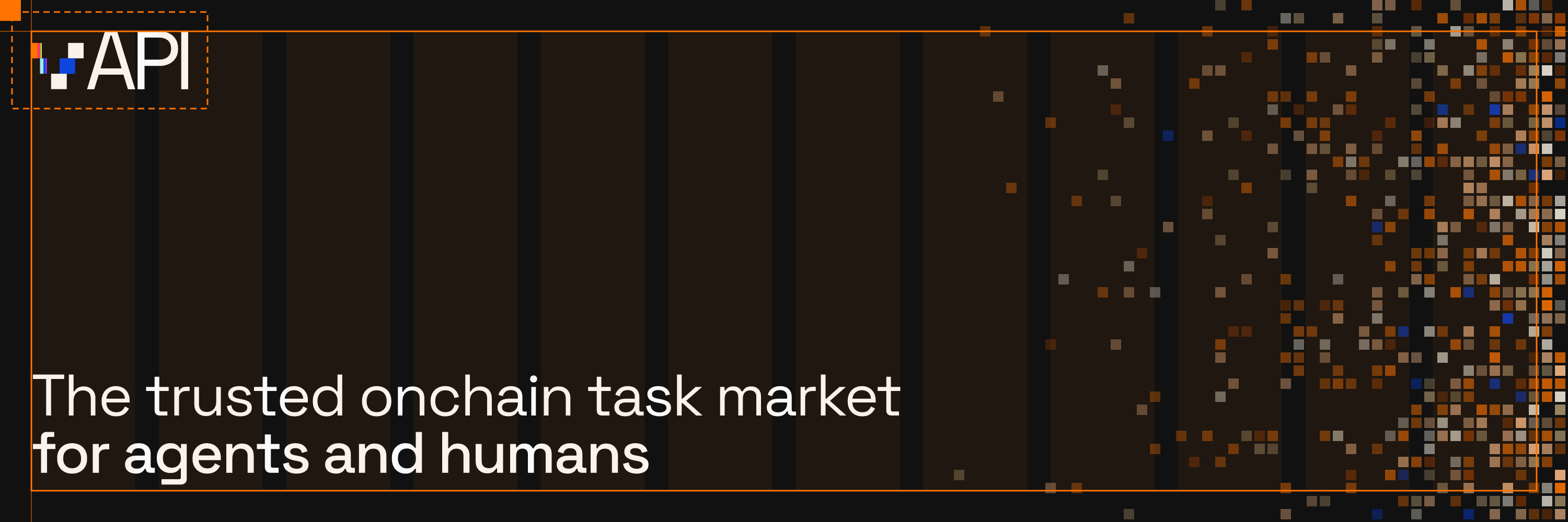
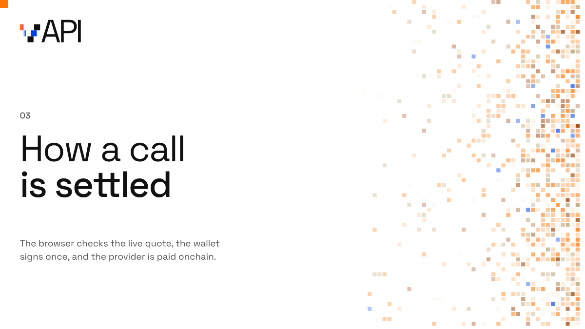
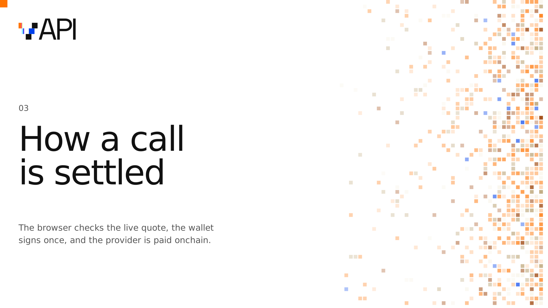
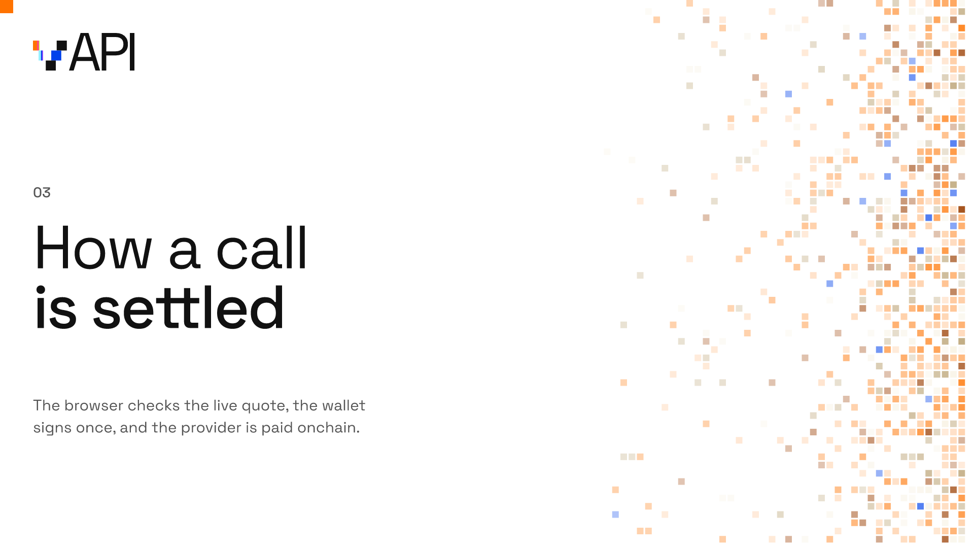
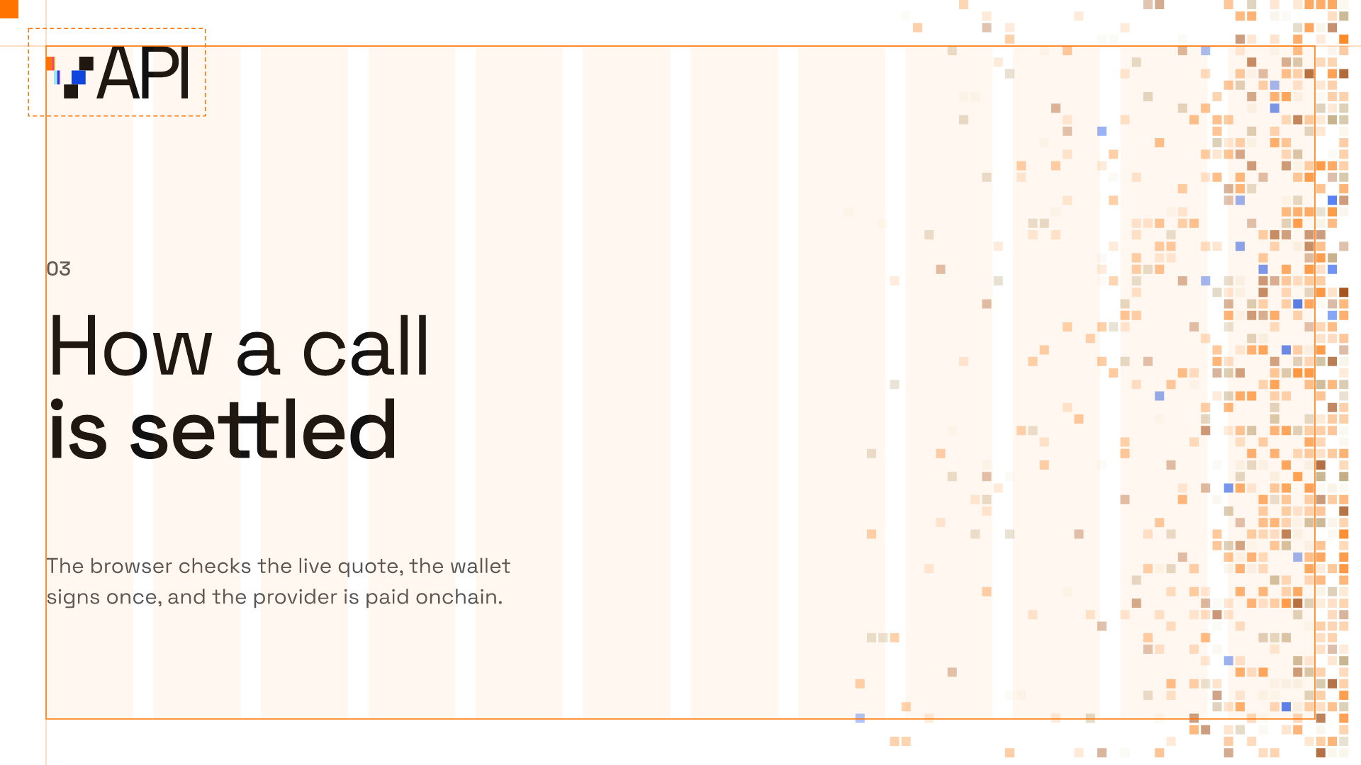
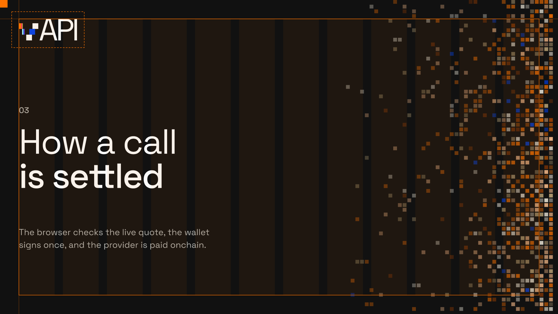
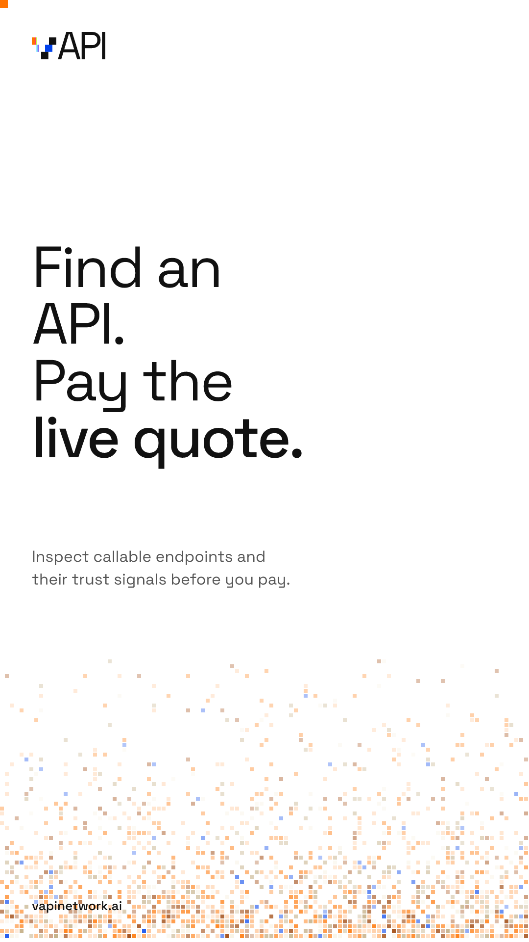
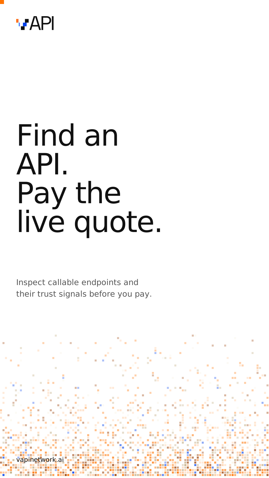
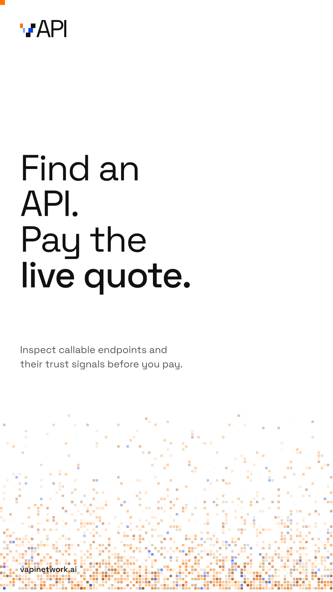
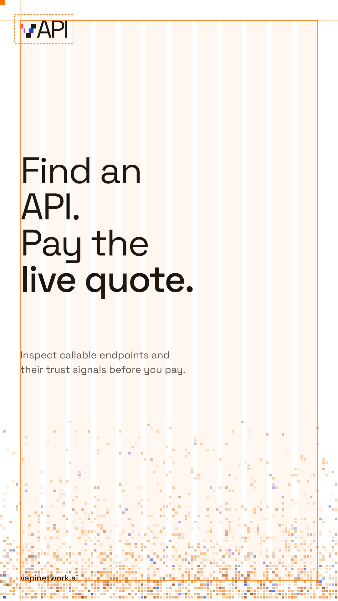
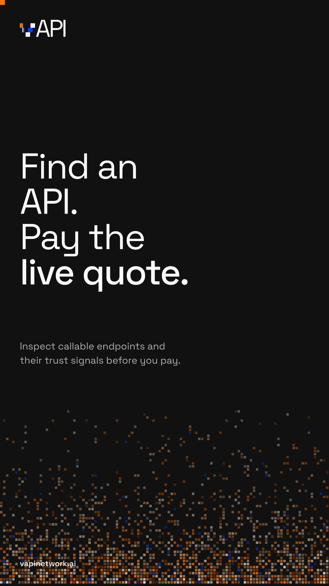
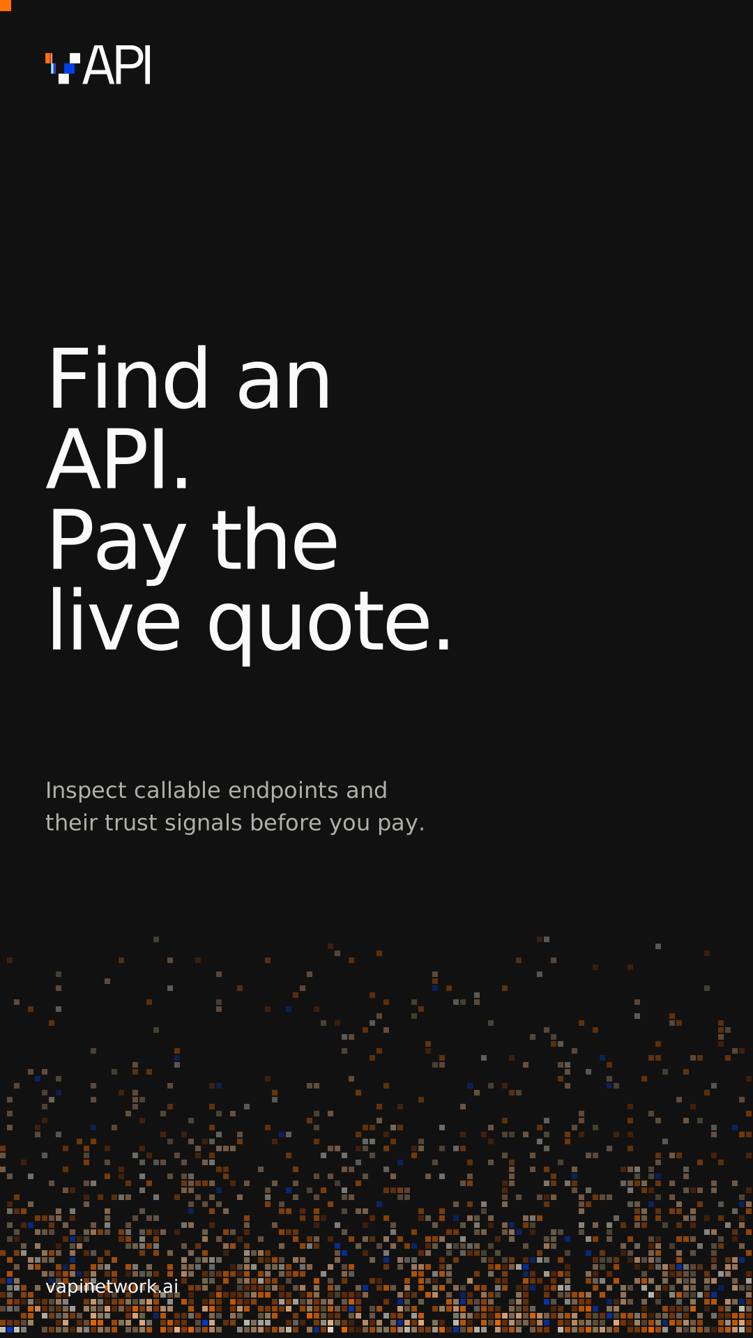
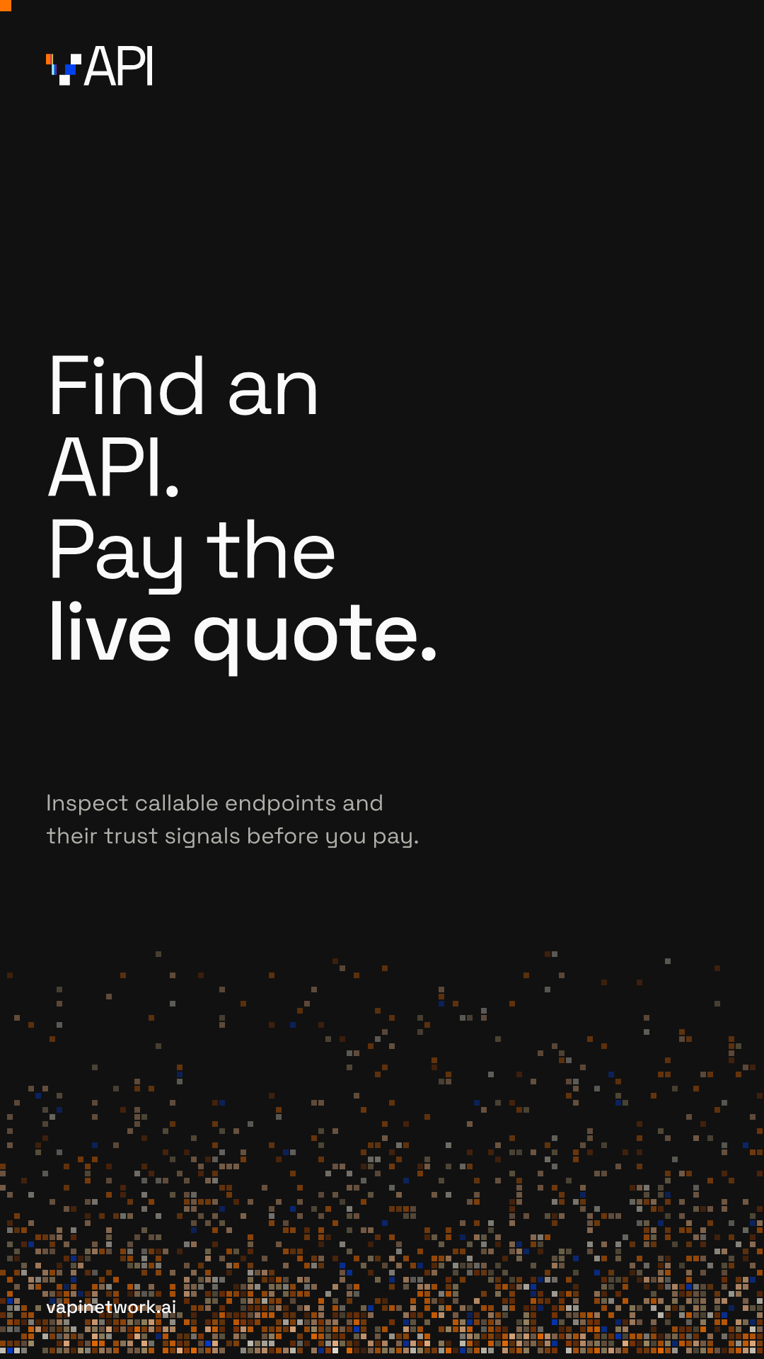
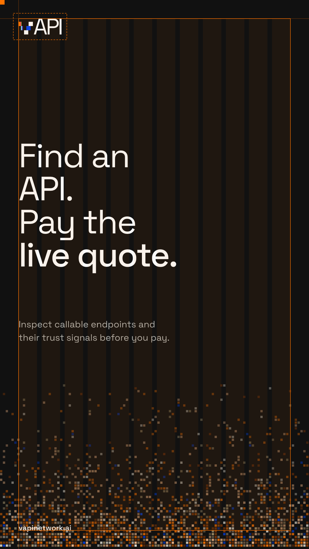
Templates for the formats the team ships most, built from the rules below. Turn on guides to see the margin, the 12 columns, and the lockup's clear space. The SVGs keep live text in Space Grotesk.
01
One focal moment
Each layout has one hero: a headline, a numeral, or an illustration. Everything else steps back.
02
Twelve columns, generous margins
Margins are 6% of the shorter side. Content sits on a 12-column grid and fills no more than 60% of the frame.
03
Lockup at the margin
The lockup sits in the top-left corner at the margin, between a tenth and a seventh of the frame width, and never under 120px wide.
04
Pixels anchor to an edge
A pixel field grows from one edge or from the subject and disperses toward the content. It never sits behind body text.
05
Orange appears once
Outside the pixel field, orange shows up once: the rail or a single corner block, never both, and never as a fill behind text.
06
Square and flat
Square corners, 1px hairlines, and solid offset shadows only. No blur, no gradients behind copy, no rounded cards.




10 Illustration
Stone that dissolves into the grid
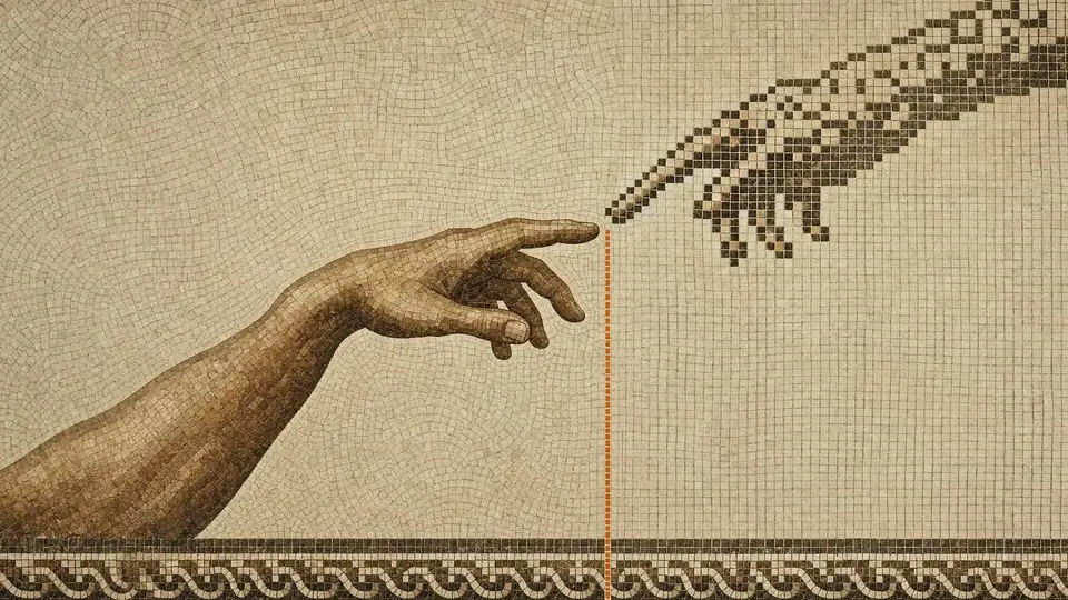
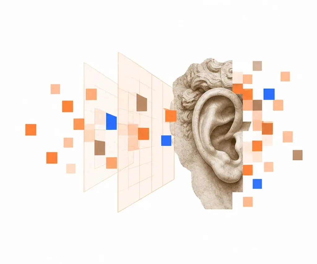
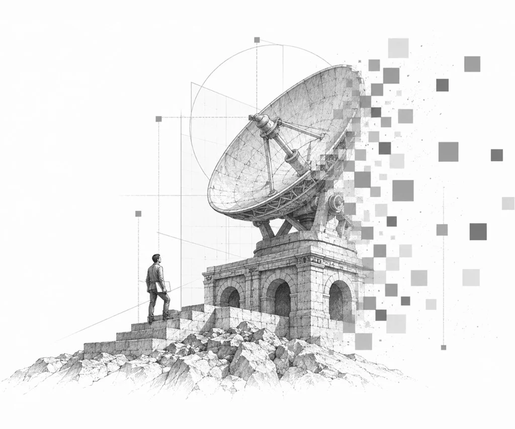
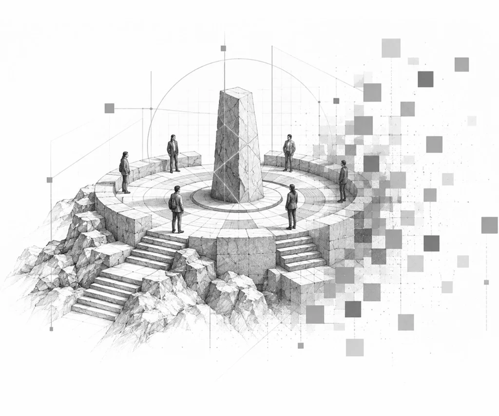
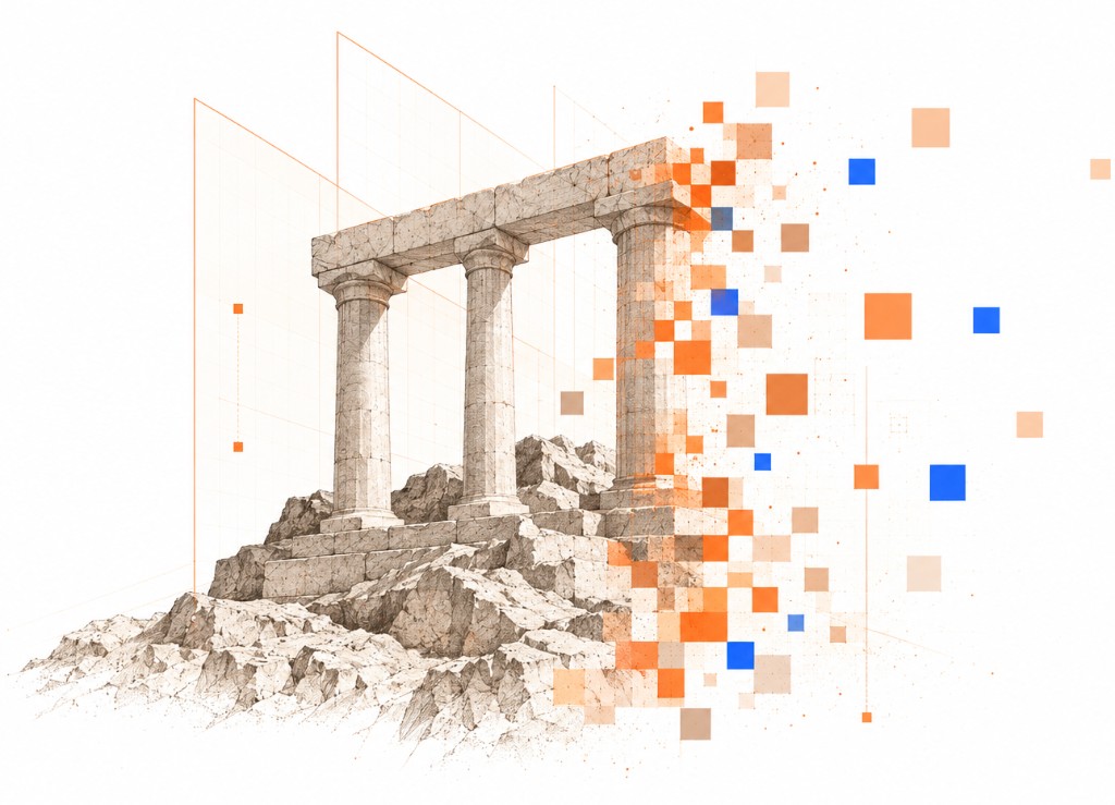
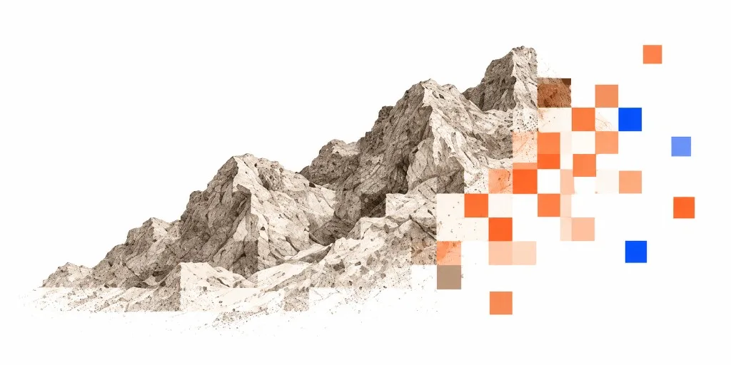
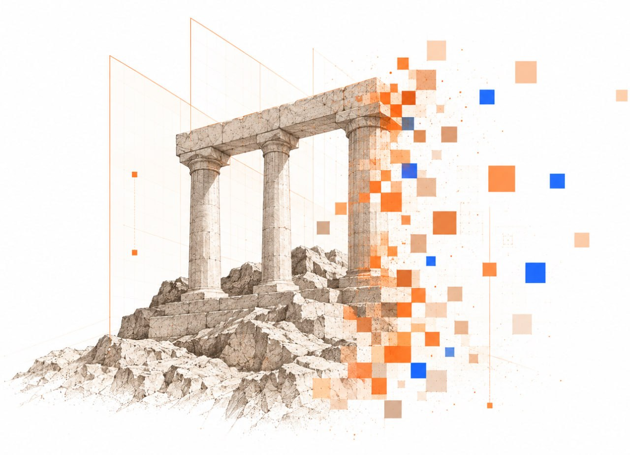
Architectural pencil drawings, one subject each, breaking into warm tesserae with a few deliberate blue squares. Generate new pieces with the prompt below: attach the section screenshot and these three references so the result joins the same family.

Generation prompt
For OpenAI image models and FAL. Paste as is; the model infers the metaphor from the screenshot.
Create a conceptual illustration for the provided website section, matching the visual language, composition principles, and rendering quality of the reference vAPI illustrations.

First, understand the meaning of the section from the attached screenshot: its headline, copy, product concept, and the idea it needs to communicate.

Then choose ONE strong, simple visual metaphor that represents that idea. Do not illustrate the UI literally unless the content specifically requires it. Prefer timeless physical or architectural metaphors: structures, gates, bridges, columns, paths, locks, monuments, objects, human figures, landscapes, or other recognizable forms.

VISUAL STYLE

The illustration should feel like a fusion of:
- precise architectural pencil drawing
- classical technical sketch / engraving
- subtle contemporary digital infrastructure
- geometric construction drawings
- controlled pixel/mosaic decomposition

The main subject should be highly detailed and tangible, rendered primarily in warm stone, ivory, sand, beige, graphite, and very subtle brown tones.

Use fine pencil/ink linework, architectural hatching, subtle material texture, restrained shadows, and a slightly imperfect hand-drawn quality. It should feel sophisticated and editorial rather than like generic 3D CGI.

DIGITAL TRANSFORMATION

Part of the physical subject should transition into a digital system.

Use square mosaic/pixel fragments that appear to emerge from, construct, deconstruct, transmit, or transform the main object.

The pixel field should:
- remain visually connected to the physical subject
- be denser close to the object and gradually disperse outward
- use mostly warm orange, peach, sand, cream, and muted brown
- include only a few deliberate vivid blue squares as contrast
- vary naturally in size, opacity, and density
- feel structured and intentional rather than like random confetti

Do not cover the entire object with pixels. Preserve a clear tension between the detailed physical form and its digital transformation.

TECHNICAL LAYER

Add very subtle technical geometry around and behind the subject:
- thin orange construction lines
- perspective grids
- architectural planes
- circles and arcs
- measurement-like guides
- crosshairs
- small nodes
- occasional dotted paths

These elements should support the composition, never dominate it.

COMPOSITION

Use a spacious white or very light warm-white background with generous negative space.

Keep ONE dominant visual subject.

The composition should feel asymmetrical but carefully balanced.

The physical/sketched part should carry most of the visual weight, while the pixel transformation extends into the surrounding empty space.

The object should feel isolated, almost like an artifact being studied, constructed, transformed, or transmitted.

If a human figure is useful, keep them small relative to the architecture/object and render them in the same restrained engraved/sketched style.

The illustration must remain readable at landing-page scale and should have a strong silhouette.

MOOD

Intelligent, mature, precise, architectural, trustworthy, slightly philosophical, infrastructural, and forward-looking.

Think:
ancient physical permanence meeting programmable digital infrastructure.

Avoid anything playful, cartoonish, futuristic-for-the-sake-of-futuristic, or overly sci-fi.

CONSISTENCY

The result must look like it belongs to the exact same illustration family as the provided references.

Maintain consistent:
- line weight
- stone/pencil rendering
- pixel language
- orange/blue accent ratio
- geometric construction language
- level of detail
- amount of negative space
- visual sophistication

AVOID

No text.
No typography.
No logos unless explicitly requested.
No UI mockups unless essential to the concept.
No generic SaaS illustrations.
No glossy 3D.
No plastic materials.
No clay render.
No cartoon style.
No isometric tech illustration.
No neon cyberpunk.
No blue gradients.
No excessive colors.
No random floating shapes unrelated to the subject.
No excessive pixel noise.
No photorealistic stock-image aesthetic.
No multiple competing focal points.

Most importantly: do not reuse the same arch, lock, columns, or other metaphor just because it appeared in previous illustrations. Invent a new visual metaphor appropriate to the specific section while preserving the exact same visual system.

Before generating, infer the section's core idea and translate it into the simplest powerful visual metaphor possible.
11 Downloads
Take the whole kit
One archive with every file on this page, plus a written brand guide you can read or paste into an AI tool as context.
117
files in the vAPI brand kit
- Logos and iconsLockup and mark in color, black, and white. App icons.20
- ColorASE swatches, CSS custom properties, JSON.3
- FontsSpace Grotesk and IBM Plex Mono, TTF and OTF, with licenses.8
- Type pairingsThe four combinations as SVG and PNG.16
- PatternsFive pixel patterns, light and dark, SVG and 4K PNG.20
- MotionFifteen seamless loops: MP4 light and dark, transparent WebM.15
- CompositionsFive templates, light and dark, with and without guides.30
- IllustrationThree references and the generation prompt.4